Silhouette score
The silhouette score is a clustering metric that rates how well each point fits its own cluster compared with the nearest other cluster, on a scale from −1 to +1.
Last updated: 05 Oct, 2026 · scikit-learn 1.9.1
A classification model is checked against the true labels with a confusion matrix, accuracy, precision or recall. A clustering model has no true labels, so the video validates it with the silhouette score. It works for K-means clustering and for Hierarchical clustering, and it checks the K that the elbow method picked.
Measuring a(i) inside the cluster
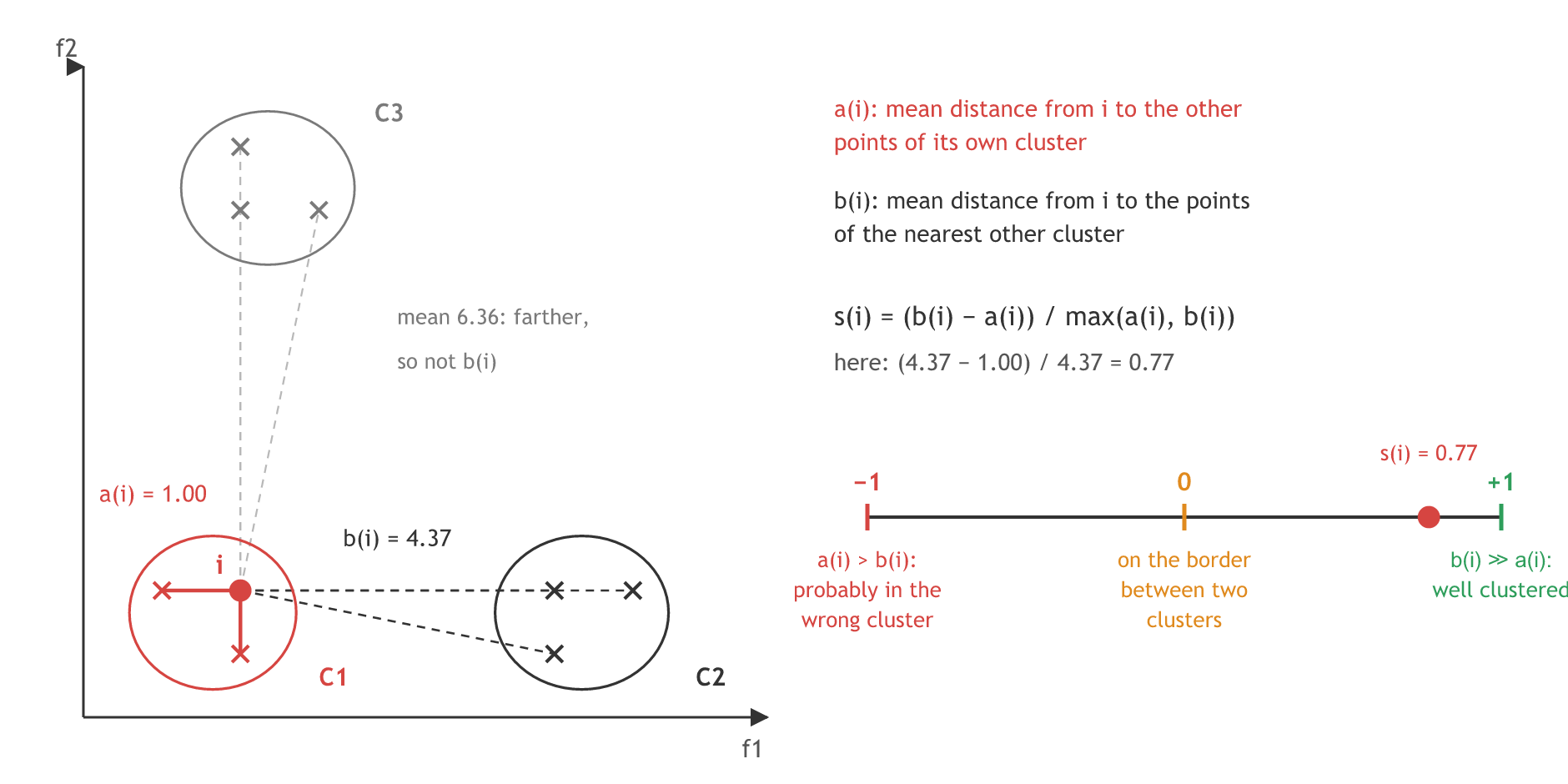
Take one point i of cluster C1. a(i) is the average distance from i to every other point of C1. The sum is divided by |C1| − 1 because i itself is left out. In this clip i is called the centroid; i is one data point of the cluster, as the video says at the end of the next clip.
Measuring b(i) and the score s(i)
b(i) looks outside the cluster. For every other cluster, average the distance from i to all of its points, and keep the smallest of those averages: the nearest other cluster.
In a good clustering a point is close to its own cluster and far from the next one, so b(i) is much larger than a(i). The board first writes a(i) ≫ b(i) as the good case and then crosses it out; the good case is b(i) ≫ a(i).
The board notes also write s(i) in three pieces, which shows the sign at a glance:
When a(i) is much smaller than b(i), the first case is close to 1. When a(i) is much larger, the last case is close to −1. So −1 ≤ s(i) ≤ 1 always holds, and the nearer the score is to +1, the better the clustering model.
s(i) runs from −1 to +1. Near +1 the point sits well inside its cluster. Near 0 it lies on the border between two clusters, and the clustering still needs improving. Below 0, a(i) is larger than b(i): the point is closer to another cluster than to its own. The silhouette score of a whole model is the mean s(i) over all points.
Computing s(i) by hand and with silhouette_samples
The diagram's nine points, three per cluster, make the formulas small enough to follow. Point i = (2, 2) is 1 away from both of its neighbours in C1, so a(i) = 1. Its distances to C2 are 4, 5 and √17 ≈ 4.12, an average of 4.37; C3 is farther, at 6.36 on average, so b(i) = 4.37 and s(i) = (4.37 − 1) / 4.37 = 0.77. The code repeats the sum and compares it with scikit-learn.
import numpy as np
from sklearn.metrics import silhouette_samples, silhouette_score

X = np.array([[2, 2], [1, 2], [2, 1],      # C1, point i is the first one
              [6, 2], [7, 2], [6, 1],      # C2
              [2, 8], [3, 8], [2, 9]])     # C3
labels = np.array([0, 0, 0, 1, 1, 1, 2, 2, 2])

i = X[0]
d = np.sqrt(((X - i) ** 2).sum(axis=1))     # distance from i to every point
a = d[1:3].mean()                            # own cluster, without i itself
b = min(d[labels == 1].mean(), d[labels == 2].mean())   # nearest other cluster
s = (b - a) / max(a, b)
print("a(i) =", round(a, 3), " b(i) =", round(b, 3), " s(i) =", round(s, 3))
print("silhouette_samples:", round(silhouette_samples(X, labels)[0], 3))
print("silhouette_score :", round(silhouette_score(X, labels), 3))a(i) = 1.0 b(i) = 4.374 s(i) = 0.771 silhouette_samples: 0.771 silhouette_score : 0.782
- The hand result and silhouette_samples agree at 0.771 for point i.
- silhouette_score is 0.782, the mean s(i) over all nine points: every cluster is tight and far from the others.
Silhouette analysis on the make_blobs data
The practical keeps the make_blobs data from K-means clustering and loops over 2 to 6 clusters with code taken from the scikit-learn example on silhouette analysis. For each value it fits KMeans with random_state=10, prints the average silhouette_score, and draws one band per cluster from silhouette_samples. Most of the example's lines only draw the plots.
The video's make_blobs data
from sklearn.datasets import make_blobs

# 500 points, 2 features, 4 centres inside the box -10 to 10
X, y = make_blobs(n_samples=500, n_features=2, centers=4, cluster_std=1,
                  center_box=(-10.0, 10.0), shuffle=True, random_state=1)
range_n_clusters = [2, 3, 4, 5, 6]   # the cluster counts to compare
Scoring one value of n_clusters
from sklearn.cluster import KMeans
from sklearn.metrics import silhouette_samples, silhouette_score

clusterer = KMeans(n_clusters=4, random_state=10)
cluster_labels = clusterer.fit_predict(X)
silhouette_avg = silhouette_score(X, cluster_labels)              # mean s(i)
sample_silhouette_values = silhouette_samples(X, cluster_labels)  # one s(i) per point
Silhouette scores for 2 to 6 clusters
For 2, 3 and 4 clusters the run below prints the video's numbers to every digit. For 5 and 6 clusters the video printed 0.56376 and 0.45047; this run prints 0.56146 and 0.48576. KMeans has changed since the video was recorded: since scikit-learn 1.4 it runs the algorithm once by default (n_init="auto" with the k-means++ start) instead of ten times, and other parts of the implementation have changed too, so for 5 and 6 clusters it settles on a slightly different grouping.
for n_clusters in range_n_clusters:
    clusterer = KMeans(n_clusters=n_clusters, random_state=10)
    cluster_labels = clusterer.fit_predict(X)
    silhouette_avg = silhouette_score(X, cluster_labels)
    print("For n_clusters =", n_clusters, "The average silhouette_score is :", silhouette_avg)
    sample_silhouette_values = silhouette_samples(X, cluster_labels)
    print("    points below 0:", (sample_silhouette_values < 0).sum(),
" lowest s(i):", round(sample_silhouette_values.min(), 3))For n_clusters = 2 The average silhouette_score is : 0.7049787496083262
points below 0: 0 lowest s(i): 0.194
For n_clusters = 3 The average silhouette_score is : 0.5882004012129721
points below 0: 5 lowest s(i): -0.14
For n_clusters = 4 The average silhouette_score is : 0.6505186632729437
points below 0: 1 lowest s(i): -0.009
For n_clusters = 5 The average silhouette_score is : 0.561464362648773
points below 0: 5 lowest s(i): -0.084
For n_clusters = 6 The average silhouette_score is : 0.4857596147013469
points below 0: 4 lowest s(i): -0.073Plotting the silhouette bands for 3 and 4 clusters
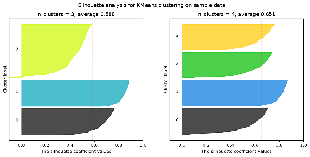
The scikit-learn example draws one figure per value of n_clusters. This shorter version draws the two cases the video compares most closely side by side: each coloured band is one cluster's sorted s(i) values, and the red dashed line is the average.
import matplotlib.pyplot as plt
import matplotlib.cm as cm

fig, axes = plt.subplots(1, 2, figsize=(12, 5))
for ax, n_clusters in zip(axes, [3, 4]):
    cluster_labels = KMeans(n_clusters=n_clusters, random_state=10).fit_predict(X)
    silhouette_avg = silhouette_score(X, cluster_labels)
    sample_silhouette_values = silhouette_samples(X, cluster_labels)
    y_lower = 10
    for i in range(n_clusters):
        # one band per cluster: its s(i) values, sorted
        ith = np.sort(sample_silhouette_values[cluster_labels == i])
        y_upper = y_lower + len(ith)
        color = cm.nipy_spectral(float(i) / n_clusters)
        ax.fill_betweenx(np.arange(y_lower, y_upper), 0, ith, facecolor=color, edgecolor=color, alpha=0.7)
        ax.text(-0.05, y_lower + 0.5 * len(ith), str(i))
        y_lower = y_upper + 10
    ax.axvline(x=silhouette_avg, color="red", linestyle="--")
    ax.set_xlim([-0.1, 1])
    ax.set_yticks([])
    ax.set_title(f"n_clusters = {n_clusters}, average {silhouette_avg:.3f}")
    ax.set_xlabel("The silhouette coefficient values")
    ax.set_ylabel("Cluster label")
    print(n_clusters, "clusters, band widths:", np.bincount(cluster_labels))
plt.suptitle("Silhouette analysis for KMeans clustering on sample data")
plt.show()3 clusters, band widths: [124 125 251] 4 clusters, band widths: [128 125 123 124]
Why the video picks K = 4
- K = 2 scores highest, 0.705, with no point below 0: the distinct blob is one cluster and the three close blobs share the other.
- K = 3 has 5 points below 0, the tail the video circles at −0.1: they sit nearer another cluster than their own, so K = 3 is rejected.
- K = 4 scores 0.651, and only one point dips below 0, to −0.009, too thin to see on the plot. Its four bands hold 123 to 128 points each.
- K = 5 and 6 score lower and have points below 0 again.
- Between the two clean options, 2 and 4, the video takes the larger one, and K = 4 agrees with the elbow method.
Validating hierarchical clustering on the Iris data
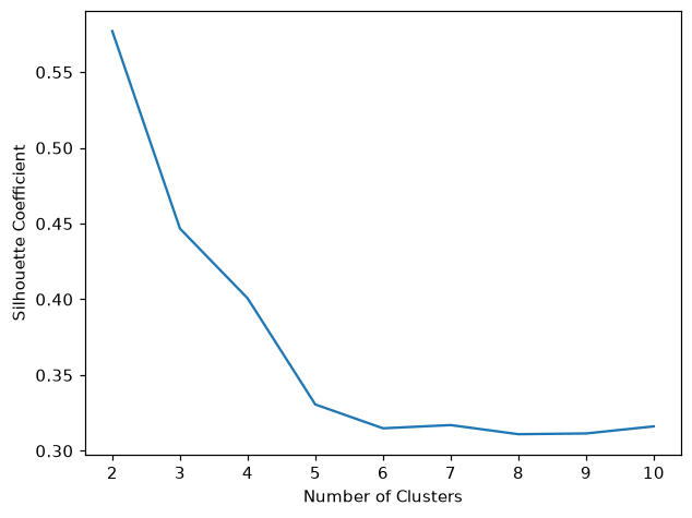
The silhouette score works the same way for Hierarchical clustering. The hierarchical clustering notebook in the course materials ends with this loop: ward clusters on the four scaled Iris features for 2 to 10 clusters, one silhouette_score each, then a line plot. Like the K-means silhouette loop, it starts at 2, because the score needs at least two clusters.
import pandas as pd
import matplotlib.pyplot as plt
from sklearn import datasets
from sklearn.preprocessing import StandardScaler
from sklearn.cluster import AgglomerativeClustering
from sklearn.metrics import silhouette_score

iris = datasets.load_iris()
X_scaled = StandardScaler().fit_transform(pd.DataFrame(iris.data, columns=iris.feature_names))

silhouette_coefficients = []
for k in range(2, 11):
    agglo = AgglomerativeClustering(n_clusters=k, metric="euclidean", linkage="ward")
    agglo.fit(X_scaled)
    silhouette_coefficients.append(silhouette_score(X_scaled, agglo.labels_))
print([round(s, 3) for s in silhouette_coefficients])

plt.plot(range(2, 11), silhouette_coefficients)
plt.xticks(range(2, 11))
plt.xlabel("Number of Clusters")
plt.ylabel("Silhouette Coefficient")
plt.show()[0.577, 0.447, 0.401, 0.331, 0.315, 0.317, 0.311, 0.311, 0.316]
What the Iris scores show
- 2 clusters score highest, 0.577, the choice the notebook and the dendrogram made.
- 3 clusters score 0.447, although Iris has three species: versicolor and virginica overlap, so a third cluster splits them along a fuzzy border.
- From 6 clusters on the score stays near 0.31: extra clusters cut real groups into pieces.
Silhouette score vs the elbow method
| Elbow method | Silhouette score | |
|---|---|---|
| Measures | WCSS: how tight each cluster is | tightness and separation from the nearest cluster |
| Reading | look for the bend in the curve | higher is better, from −1 to +1 |
| Per point | no | yes: silhouette_samples gives every s(i) |
| Used for | picking K | validating K and the clusters |
Where you use the silhouette score
- Choosing K for K-means, next to the elbow curve.
- Comparing two clustering models on the same data, such as K-means against hierarchical clustering.
- Finding misplaced points: a negative s(i) marks a point that sits nearer another cluster.
Related
- Previous: Hierarchical clustering
- Next: DBSCAN
- Reference: scikit-learn example: silhouette analysis on KMeans clustering
- In the nine-point example, change the label of [6, 2] from 1 to 0 and read its silhouette_samples value.
- Change range_n_clusters to [2, 3, 4, 5, 6, 7, 8] in the score loop and see whether any K beats 0.705.
- In the score loop, add n_init=10 to KMeans and compare the 5- and 6-cluster scores with the run above: ten starts settle on yet another grouping, and neither run reproduces the video's 0.564 and 0.450.
You understood something today that you didn't yesterday.