
Bar charts and pie charts
A bar chart is a chart of categorical data that draws one separate bar per category, with the bar's height equal to the category's frequency; a pie chart shows the same counts as slices of a circle sized by their share.
Last updated: 07 Oct, 2026 · SciPy 1.18
The Frequency distribution lesson counted nine flowers: Rose 3, Lily 4, Sunflower 2. A table of counts is exact but slow to read. The same numbers drawn as bars, or as slices, show at a glance which category is the largest.
Drawing a bar chart from the flower table
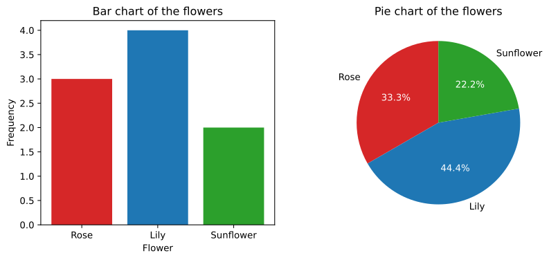
The video draws the chart from the frequency table. The x axis lists the categories, Rose, Lily and Sunflower; the y axis is the frequency, 1, 2, 3 and up. Each category gets one bar as tall as its count: Rose to 3 in red, Lily to 4 in blue, Sunflower to 2 in green. It is still descriptive statistics: a summary of the data in hand.
Two things make it a bar chart and not a histogram. The bars stand apart, with gaps, because the categories are separate. And the order along the axis carries no meaning for nominal data like flowers, so the bars are often sorted from tallest to shortest; for ordinal data, such as T-shirt sizes, keep the natural order. The y axis starts at zero, because the reader compares bar lengths.
A bar chart also suits a discrete variable with a few values, such as the number of people at a table: one bar per value. A numeric variable with many values needs a histogram.
Drawing a pie chart
A pie chart draws the relative frequencies as slices of one circle. Each slice's angle is its share of 360 degrees, so the slices always fill the circle exactly:
A pie chart answers one question well: what share of the whole is each part? It fits a few categories that make up one total. With many categories, or close values, the slices are hard to compare, and a bar chart is the better choice.
Plotting the flowers in matplotlib
The frequency table as lists
import matplotlib.pyplot as plt

flowers = ["Rose", "Lily", "Sunflower"]
counts = [3, 4, 2]                            # the frequency table
colors = ["tab:red", "tab:blue", "tab:green"] # the board's pen colours
Counting raw values with seaborn
When the data is the raw list of flowers rather than the counts, seaborn counts and draws in one call:
import seaborn as sns

sns.countplot(x=["Rose", "Lily", "Sunflower", "Rose", "Lily",
                 "Sunflower", "Rose", "Lily", "Lily"])
Drawing the bar chart and the pie chart
fig, (ax1, ax2) = plt.subplots(1, 2, figsize=(10, 4))
ax1.bar(flowers, counts, color=colors)
ax1.set_title("Bar chart of the flowers")
ax1.set_xlabel("Flower")
ax1.set_ylabel("Frequency")
_, _, pct = ax2.pie(counts, labels=flowers, colors=colors, autopct="%1.1f%%", startangle=90)
for t in pct:
    t.set_color("white")                      # readable percentages on the slices
ax2.set_title("Pie chart of the flowers")
plt.show()
print("slice angles:", [360 * c / sum(counts) for c in counts])slice angles: [120.0, 160.0, 80.0]
Reading the two charts
- The bars stand at 3, 4 and 2, the frequencies, with Lily the tallest.
- The slices are 33.3%, 44.4% and 22.2%, the relative frequencies 3/9, 4/9 and 2/9.
- The angles are 120°, 160° and 80°, which add up to 360°.
- Both charts show the same table: the bar chart makes the counts easy to compare, the pie chart makes the share of the whole easy to see.
Bar chart vs pie chart
| Bar chart | Pie chart | |
|---|---|---|
| Shows | Counts (or shares) per category | Shares of one whole |
| Compares by | Bar length, which eyes judge well | Angle and area, which eyes judge less well |
| Number of categories | Many | A few, about five or fewer |
| Needs | A y axis starting at zero | Parts that add up to one total |
| In matplotlib | plt.bar(categories, counts) | plt.pie(counts, labels=...) |
Where you use bar and pie charts
- Survey results: answers per option as bars, sorted by count.
- Exploring categorical columns:
sns.countploton each column of a dataset, such as the day of the week in tips. - Market share or a budget split: a pie chart of a few parts that make up 100%.
bar), and only use a pie chart when the parts add up to one whole.Related
- Previous: Frequency distribution
- Next: Histograms
- Reference: matplotlib pyplot.bar
- Draw the notes' colours:
flowers = ["Green", "Red", "Yellow"]andcounts = [3, 3, 2]. What are the slice angles now? - Swap
ax1.barforax1.barhto draw horizontal bars, which suit long category names. - Add
ax1.set_ylim(1.5, 4.5)and look at how much bigger Lily's bar seems.
Slow is fine. Stopping is the only problem.