
Five-number summary and box plot
The five-number summary is a description of a dataset by five values (the minimum, Q1, the median, Q3 and the maximum), and a box plot is the chart that draws them, with outliers shown as separate points.
Last updated: 07 Oct, 2026 · SciPy 1.18
Quartiles and the interquartile range found Q1 = 3, Q3 = 7 and the fences −3 and 13 for the board's 19 values, and flagged 27 as an outlier. The five-number summary collects the quartiles with the median and the extremes, and the box plot turns them into a picture you can read at a glance.
Listing the five numbers
The five numbers are the minimum, the first quartile Q1, the median, the third quartile Q3 and the maximum. For the 19 values 1, 2, 2, 2, 3, 3, 4, 5, 5, 5, 6, 6, 6, 6, 7, 8, 8, 9, 27:
- Minimum: 1.
- Q1: 3, the 5th value.
- Median: 5, the 10th value, the middle of 19.
- Q3: 7, the 15th value.
- Maximum: 27, the outlier. The largest value inside the fences is 9.
So the five-number summary of the 19 values is 1, 3, 5, 7, 27. A box plot draws the box from these quartiles, ends the upper whisker at 9, the largest value once 27 is set apart, and marks 27 as a point of its own.
Drawing the box plot
A box plot sits over a number line. The box runs from Q1 to Q3, so its length is the IQR, and a line inside it marks the median. The whiskers reach out to the smallest and largest values that are still inside the fences, here 1 and 9. A value beyond a fence is not joined to the whisker: it is drawn as its own point, so 27 appears as one dot far to the right. Drawn to scale, the gap between 9 and 27 is longer than the whole box and both whiskers together.
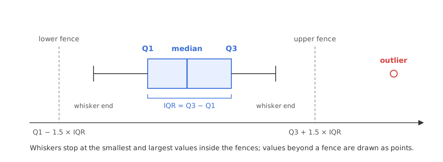
The box plot is used extensively in data visualization, and it is the answer to a common interview question: what is a box plot used for? It shows where outliers are, and in the same picture the median, the spread of the middle half and the skew. A median close to one end of the box, or one whisker much longer than the other, means the data is skewed towards the longer side.
Drawing a box plot in Python
matplotlib's boxplot and bxp
plt.boxplot computes the quartiles itself with the linear method and the 1.5 × IQR whiskers. ax.bxp draws a box from statistics you pass in, which lets the plot use the board's quartiles. orientation='horizontal' lays the box along the x axis.
import matplotlib.pyplot as plt

plt.boxplot(data, orientation="horizontal")     # quartiles by the linear method
ax.bxp([stats], orientation="horizontal")        # a box from your own q1, med, q3, whiskers
pandas describe for the summary
describe() prints the count, mean, standard deviation, minimum, 25%, 50%, 75% and maximum: the five-number summary plus three extras, with the linear quartiles.
import pandas as pd

pd.Series(data).describe()
Drawing the 19 values two ways
import numpy as np
import pandas as pd
import matplotlib.pyplot as plt
from matplotlib.cbook import boxplot_stats

data = [1, 2, 2, 2, 3, 3, 4, 5, 5, 5, 6, 6, 6, 6, 7, 8, 8, 9, 27]
q1, med, q3 = np.percentile(data, [25, 50, 75], method="weibull")
iqr = q3 - q1
inside = [x for x in data if q1 - 1.5 * iqr <= x <= q3 + 1.5 * iqr]
print("five-number summary:", min(data), q1, med, q3, max(data))
print("whiskers:", min(inside), max(inside), " drawn as points:", [x for x in data if x not in inside])
print(pd.Series(data).describe().round(3).to_dict())

board = {"q1": q1, "med": med, "q3": q3, "whislo": min(inside), "whishi": max(inside),
         "fliers": [x for x in data if x not in inside]}
default = boxplot_stats(data)[0]
fig, axes = plt.subplots(2, 1, figsize=(8, 3.6), sharex=True)
axes[0].bxp([board], orientation="horizontal")
axes[0].set_title("(n + 1)p quartiles: box from 3 to 7")
axes[1].bxp([default], orientation="horizontal")
axes[1].set_title("matplotlib default (linear) quartiles: box from 3 to 6.5")
for ax in axes:
    ax.set_yticks([])
axes[1].set_xticks([-2, 0, 2, 4, 6, 8, 10, 13, 20, 27])
plt.tight_layout()
plt.show()five-number summary: 1 3.0 5.0 7.0 27
whiskers: 1 9 drawn as points: [27]
{'count': 19.0, 'mean': 6.053, 'std': 5.563, 'min': 1.0, '25%': 3.0, '50%': 5.0, '75%': 6.5, 'max': 27.0}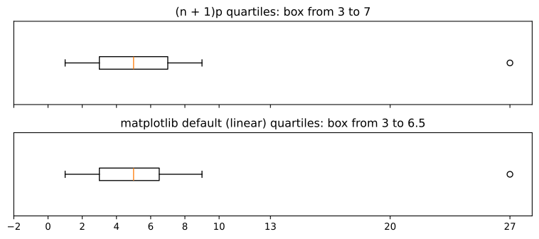
What the two box plots show
- The five-number summary of all 19 values is 1, 3.0, 5.0, 7.0, 27.
- The whiskers end at 1 and 9, and 27 is the one point drawn on its own.
- describe() reports 25% = 3.0, 50% = 5.0 and 75% = 6.5, the linear quartiles, along with the mean 6.053 and the standard deviation 5.563 that the outlier inflates.
- The two boxes differ only at Q3: 7 with the (n + 1)p method, 6.5 with matplotlib's default. The whiskers and the outlier are the same in both.
Box plot vs histogram
| Box plot | Histogram | |
|---|---|---|
| Shows | five numbers and outliers | the whole shape, bin by bin |
| Good at | comparing many groups side by side | seeing peaks, gaps and the shape of the tails |
| Outliers | drawn as separate points | a small bar far from the rest |
| Hides | two peaks in the middle (a box looks the same) | exact quartiles |
A histogram of the same data is in Histograms; the two charts answer different questions and often sit side by side.
Where you use the five-number summary and box plot
- Exploratory data analysis: one box per column, or one per category, shows spread and outliers before any model is trained.
- Comparing groups: salaries by department or delivery times by city, one box each on a shared axis.
- Spotting skew: a long whisker on one side and a median off the centre of the box.
Related
- Previous: Quartiles and the interquartile range
- Next: Outlier detection with IQR and z-score
- See also: Skewness and kurtosis
- Replace 27 with 13 and run the example: in the top plot 13 sits on the fence, so the whisker reaches it; the bottom plot's fence is 11.75, so it still draws 13 as a separate point.
- Add
whis=3to aplt.boxplotcall and see that 27 is still beyond the 3 × IQR fence. - Print
boxplot_stats(data)[0]and find the median, the quartiles and the whisker ends it used.
Slow is fine. Stopping is the only problem.