
Frequency distribution
A frequency distribution is a table that lists each value or class of a variable together with its frequency, the number of times it occurs in the data.
Last updated: 07 Oct, 2026 · SciPy 1.18
Once the scale of a variable is known, the first descriptive step is to count. A frequency table turns a long list of values into a few rows, and every chart in this part is drawn from one.
Counting the flowers
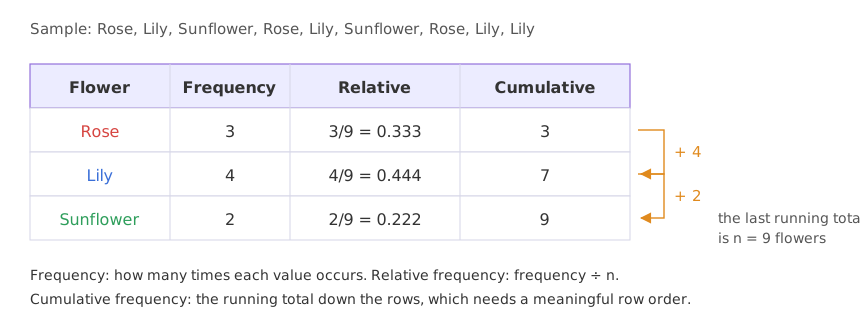
The video's sample dataset is a list of nine flowers of three types: Rose, Lily, Sunflower, Rose, Lily, Sunflower, Rose, Lily, Lily. To show it at a glance, count each type. Rose appears 3 times, Lily 4 times and Sunflower 2 times. The three counts are the frequencies, and a table of them is a frequency distribution. Bar charts and pie charts are drawn from this table, as Bar charts and pie charts shows.
Adding relative frequency
A relative frequency divides each frequency by the number of values n, so the column adds up to 1 (or 100%). It makes tables of different sizes comparable: 4 lilies out of 9 and 40 out of 90 are the same 0.444.
Adding cumulative frequency
A cumulative frequency is a running total down the table. The video starts with the 3 roses, adds the 4 lilies to get 7, adds the 2 sunflowers to get 9, and the last value is the total number of flowers.
The flowers are nominal, so their rows could be listed in any order: Lily, Rose, Sunflower would give 4, 7, 9 instead. Only the last total means something on its own. Cumulative frequency becomes useful on ordered values, where a running total answers "how many are at most this?"
Grouping numbers into classes
A numeric variable with many different values is counted in classes, ranges of equal width. The video's histogram data, 16 ages, falls into five classes of width 10. Each class is written [10, 20), which includes 10 and excludes 20, so a value on a boundary is counted once; Histograms covers that choice. On these ordered classes the cumulative column is meaningful: 10 of the 16 ages are below 40.
Building frequency tables in pandas
Counting the flowers with value_counts
import pandas as pd

flowers = pd.Series(["Rose", "Lily", "Sunflower", "Rose", "Lily",
                     "Sunflower", "Rose", "Lily", "Lily"])
counts = flowers.value_counts(sort=False)    # sort=False keeps the order of the data
Grouping the ages into classes with pd.cut
ages = pd.Series([10, 12, 14, 18, 24, 26, 30, 35, 36, 37, 40, 41, 42, 43, 50, 51])
classes = pd.cut(ages, bins=range(10, 70, 10), right=False)   # [10, 20), [20, 30), ...
age_counts = classes.value_counts(sort=False)
Printing the flower and age tables
table = pd.DataFrame({"frequency": counts})
table["relative"] = (counts / counts.sum()).round(3)
table["cumulative"] = counts.cumsum()
print(table.to_string())
print()
age_table = pd.DataFrame({"frequency": age_counts})
age_table["cumulative"] = age_counts.cumsum()
age_table["cumulative relative"] = (age_counts.cumsum() / len(ages)).round(3)
print(age_table.to_string()) frequency relative cumulative
Rose 3 0.333 3
Lily 4 0.444 7
Sunflower 2 0.222 9
frequency cumulative cumulative relative
[10, 20) 4 4 0.250
[20, 30) 2 6 0.375
[30, 40) 4 10 0.625
[40, 50) 4 14 0.875
[50, 60) 2 16 1.000Reading the two tables
- Rose 3, Lily 4, Sunflower 2: the board's frequency table, with cumulative 3, 7 and 9.
- Relative 0.333, 0.444, 0.222: the shares of the nine flowers; they add up to 1 (0.999 after rounding).
- Ages 4, 2, 4, 4, 2: the counts in [10, 20) up to [50, 60), which add up to 16.
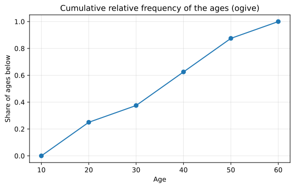
- Cumulative relative 0.625 at [30, 40): 62.5% of the ages are below 40, the kind of statement a percentile makes, as Percentiles and percentile rank shows.
Drawing the cumulative frequency curve
Plotting the cumulative share against each class's upper boundary gives an ogive, which reads off how many values lie below any age:
import matplotlib.pyplot as plt

edges = [10, 20, 30, 40, 50, 60]
cum_share = [0] + (age_counts.cumsum() / len(ages)).tolist()
plt.figure(figsize=(7, 4))
plt.plot(edges, cum_share, marker="o")
plt.title("Cumulative relative frequency of the ages (ogive)")
plt.xlabel("Age")
plt.ylabel("Share of ages below")
plt.grid(alpha=0.3)
plt.show()
print([round(v, 3) for v in cum_share])[0, 0.25, 0.375, 0.625, 0.875, 1.0]
Frequency vs relative frequency vs cumulative frequency
| Frequency | Relative frequency | Cumulative frequency | |
|---|---|---|---|
| What it is | Count of each value or class | Count ÷ n | Running total of the counts |
| Adds up to | n | 1 | Its last row equals n |
| Flowers | 3, 4, 2 | 0.333, 0.444, 0.222 | 3, 7, 9 |
| Needs ordered rows | No | No | Yes, to mean anything |
| In pandas | value_counts() | value_counts(normalize=True) | value_counts(sort=False).cumsum() |
Where you use frequency distributions
- Exploring a new dataset:
value_counts()on every categorical column shows its categories, typos and rare values. - Checking class balance in machine learning: the relative frequency of the labels shows whether one class is rare, which changes how a model is trained and scored.
- Grouped tables for reports: customers by age band or orders by price band, the counts a histogram draws.
value_counts() leaves out missing values by default (dropna=True), so the frequencies can add up to less than the number of rows. Pass dropna=False to count the missing values as their own row.Related
- Previous: Measurement scales
- Next: Bar charts and pie charts
- Reference: pandas Series.value_counts
- The notes use colours instead:
["Green", "Red", "Yellow", "Green", "Red", "Yellow", "Green", "Red"]. Is the table Green 3, Red 3, Yellow 2? - Print
flowers.value_counts(normalize=True)to get the relative frequencies in one call. - Change
right=Falsetoright=True, include_lowest=Trueinpd.cut. Which classes change, and which ages moved?
You understood something today that you didn't yesterday.