
Histograms
A histogram is a chart of numeric data that groups the values into adjacent bins on a number line and draws a bar over each bin whose area shows how many values fall in it.
Last updated: 07 Oct, 2026 · SciPy 1.18
A bar chart has one bar per category. A numeric variable such as age has too many different values for that, so a histogram first groups them into ranges, the classes of the Frequency distribution lesson, and then draws the counts.
Grouping the 16 ages into bins
The video's dataset is 16 ages:
10, 12, 14, 18, 24, 26, 30, 35, 36, 37, 40, 41, 42, 43, 50, 51
A histogram groups them into bins. The video uses bins 10 years wide: 10 to 20, 20 to 30, up to 50 to 60. The x axis is the age, the y axis the frequency, and each bin gets a bar as tall as its count. Unlike a bar chart, the bars touch, because the bins cover the number line without gaps.
A value that falls on a boundary, such as 30, could belong to two bins, so a histogram needs a rule. Four of the ages sit on an edge: 10, 30, 40 and 50.
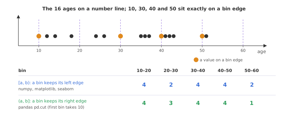
- Left-closed bins, written [20, 30), keep their left edge: 30 goes into 30 to 40. NumPy, matplotlib and seaborn count this way (only the last bin also keeps its right edge), giving 4, 2, 4, 4, 2.
- Right-closed bins, written (20, 30], keep their right edge: 30 goes into 20 to 30 and 50 into 40 to 50. This is how the video counts, and how pandas'
pd.cutcounts by default (withinclude_lowest=Trueso the first bin keeps 10), giving 4, 3, 4, 4, 1.
Both are valid; what matters is to use one rule and say which. The plots below come from matplotlib, so they show 4, 2, 4, 4, 2.
Choosing the bin width
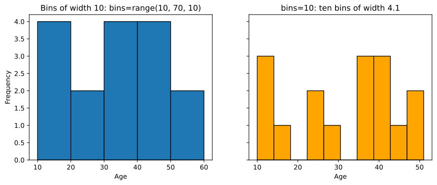
The bin width shapes the picture. In code, a width of 10 is set by passing the edges, bins=range(10, 70, 10). A single number means something else: bins=10 asks for ten bins of equal width from the smallest to the largest value. For these ages that is (51 − 10) / 10 = 4.1 years per bin, and ten is also what matplotlib and NumPy use when you give no bins at all.
Narrow bins show detail and noise; wide bins show the overall shape and hide detail. The notes make the same point: 0 to 50 cut into bins of 5 (0 to 5, 5 to 10, ...) gives a very different picture from bins of 10. Rules of thumb pick a width from the data: Sturges uses ⌈log₂ n⌉ + 1 bins, which is 5 for n = 16; Freedman–Diaconis sets the width from the spread of the middle half of the data; NumPy's bins="auto" takes whichever of the two gives narrower bins.
Plotting the ages in matplotlib
import matplotlib.pyplot as plt

ages = [10, 12, 14, 18, 24, 26, 30, 35, 36, 37, 40, 41, 42, 43, 50, 51]
fig, (ax1, ax2) = plt.subplots(1, 2, figsize=(11, 4), sharey=True)
counts, edges, _ = ax1.hist(ages, bins=range(10, 70, 10), edgecolor="black")
ax1.set_title("Bins of width 10: bins=range(10, 70, 10)")
ax1.set_xlabel("Age")
ax1.set_ylabel("Frequency")
counts10, edges10, _ = ax2.hist(ages, bins=10, edgecolor="black", color="orange")
ax2.set_title("bins=10: ten bins of width 4.1")
ax2.set_xlabel("Age")
plt.show()
print("width 10 counts:", counts.astype(int).tolist(), " edges:", edges.astype(int).tolist())
print("bins=10 counts :", counts10.astype(int).tolist())
print("bins=10 edges :", edges10.round(1).tolist())width 10 counts: [4, 2, 4, 4, 2] edges: [10, 20, 30, 40, 50, 60] bins=10 counts : [3, 1, 0, 2, 1, 0, 3, 3, 1, 2] bins=10 edges : [10.0, 14.1, 18.2, 22.3, 26.4, 30.5, 34.6, 38.7, 42.8, 46.9, 51.0]
Reading the two histograms
- Width 10 gives 4, 2, 4, 4, 2 over the edges 10, 20, 30, 40, 50, 60: the shape of the board, with a dip in the twenties.
- bins=10 gives 3, 1, 0, 2, 1, 0, 3, 3, 1, 2: ten bins of 4.1 years starting at 10, with empty bins. The same 16 ages look ragged, because each bin holds only a few values.
- The counts add up to 16 both ways: the bins change the picture, never the data.
Choosing bins with a rule
import numpy as np

ages = [10, 12, 14, 18, 24, 26, 30, 35, 36, 37, 40, 41, 42, 43, 50, 51]
for rule in ["sturges", "fd", "auto"]:
    edges = np.histogram_bin_edges(ages, bins=rule)
    print(f"{rule:8} {len(edges) - 1} bins of width {edges[1] - edges[0]:.2f}")

# the dataset of the notes' outlier notebook, with its default plt.hist(dataset)
dataset = [11, 10, 12, 14, 12, 15, 14, 13, 15, 102, 12, 14, 17, 19, 107, 10, 13,
           12, 14, 12, 108, 12, 11, 14, 13, 15, 10, 15, 12, 10, 14, 13, 15, 10]
counts, edges = np.histogram(dataset)        # bins=10, as plt.hist uses
print("notebook counts:", counts.tolist())
print("notebook edges :", edges.round(1).tolist())sturges 5 bins of width 8.20 fd 3 bins of width 13.67 auto 5 bins of width 8.20 notebook counts: [31, 0, 0, 0, 0, 0, 0, 0, 0, 3] notebook edges : [10.0, 19.8, 29.6, 39.4, 49.2, 59.0, 68.8, 78.6, 88.4, 98.2, 108.0]
- Sturges and auto give 5 bins of width 8.2 for the ages; Freedman–Diaconis gives 3 wider ones, so for 16 values the rules disagree, and a round width of 10 is as good a choice.
- The notebook's default histogram puts 31 values in the first bin and 3 in the last, with eight empty bins between. Three large values, 102, 107 and 108, stretch the range to 10 to 108, so each of the ten bins is 9.8 wide and the shape of the other 31 values disappears. Spotting such values is the job of Outlier detection with IQR and z-score.
Reading area, not height
With equal bins, height and area tell the same story. With unequal bins they do not: a bin twice as wide collects about twice as many values without the data being any denser. A histogram then draws the density, the count divided by n and by the bin width, so that each bar's area is its share of the data and all the areas add up to 1. plt.hist(..., density=True) draws this, and it is the scale the probability density function uses.
Bar chart vs histogram
The video ends with the interview question: what is the difference between a bar chart and a histogram?
| Bar chart | Histogram | |
|---|---|---|
| Data | Categories, or a discrete variable with a few values | Numeric data with many values |
| x axis | Separate categories | A number line cut into bins |
| Bars | Separated by gaps | Touching |
| Order of bars | Free for nominal data | Fixed by the numbers |
| What shows the count | Height | Area (height too, when the bins are equal) |
| Choice that changes the picture | Sorting the bars | The bin width and the edge rule |
Where you use histograms
- The first look at a numeric column: its centre, its spread, whether it has one peak or two, and long tails.
- Spotting outliers and data errors: an empty stretch of bins with a few values far away, as in the notebook's dataset.
- Checking a model's residuals or a feature's shape before choosing a transform, a step the Normality tests (Q-Q plot and Shapiro-Wilk) lesson makes precise.
bins=10 means ten bins, not bins of width 10. For a width, pass the edges, bins=range(start, stop, width). And when values sit on bin edges, NumPy and pandas can count them in different bins, so say which rule a table uses.Related
- Previous: Bar charts and pie charts
- Next: Probability density function (PDF) and KDE
- Reference: NumPy histogram_bin_edges
- The notes' assignment:
[10, 13, 18, 22, 27, 32, 38, 40, 45, 51, 56, 57, 88, 90, 92, 94, 99]withbins=range(0, 110, 10). Do you get 0, 3, 2, 2, 2, 3, 0, 0, 1, 4? - Count the same assignment with
pd.cut(data, range(0, 110, 10), include_lowest=True).value_counts(sort=False). Which bins change, and which values sit on an edge? - Draw the ages with
bins=range(10, 60, 5). What does the narrower width show?
This is what real progress feels like.