
Normality tests (Q-Q plot and Shapiro-Wilk)
A normality check is a set of plots and tests that judge whether data could come from a normal distribution: the histogram and the Q-Q plot show the shape, and the Shapiro-Wilk test puts a p-value on it.
Last updated: 07 Oct, 2026 · SciPy 1.18
Empirical rule (68-95-99.7), the z-table in Z-table and normal probabilities and several tests assume a normal distribution. Before relying on them, check the data. The notes that go with the video write "Q-Q plot" beside the bell curve: it is the standard picture for this check, and a formal test goes with it.
Looking at the histogram first
Four columns from the video's Python session: iris sepal_width, sepal_length and petal_length, and the tips total_bill. A histogram with a kernel density curve (the KDE from Probability density function (PDF) and KDE) gives the first impression.
import matplotlib.pyplot as plt
import seaborn as sns

iris = sns.load_dataset("iris")
tips = sns.load_dataset("tips")
columns = {"sepal_width": iris["sepal_width"], "sepal_length": iris["sepal_length"],
           "petal_length": iris["petal_length"], "total_bill": tips["total_bill"]}

fig, axes = plt.subplots(2, 2, figsize=(10, 7))
for ax, (name, values) in zip(axes.flat, columns.items()):
    sns.histplot(x=values, kde=True, ax=ax)
    ax.set_title(name)
    print(f"{name:13} mean {values.mean():6.3f}  median {values.median():6.3f}")
plt.tight_layout()
plt.show()sepal_width mean 3.057 median 3.000 sepal_length mean 5.843 median 5.800 petal_length mean 3.758 median 4.350 total_bill mean 19.786 median 17.795
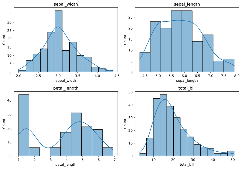
- sepal_width is a single, fairly symmetric bell.
- sepal_length is roughly symmetric, but flatter on top than a normal curve.
- petal_length has two peaks: the short petals of setosa and the longer petals of the other two species. A mix of groups like this is not normal.
- total_bill has a long right tail: a few large bills.
The printed means and medians agree with the pictures. For the two sepal columns they are close. petal_length's mean, 3.758, sits well below its median, 4.350, pulled down by the setosa cluster, and total_bill's mean, 19.786, is above its median, 17.795, pulled up by the long right tail.
Reading a Q-Q plot
A Q-Q (quantile-quantile) plot sorts the data and plots each value against the value a normal distribution would put at the same rank. If the data are normal, the points fall on a straight line. scipy's probplot draws the points against the standard normal quantiles and adds the best-fit line.
- Points on the line: consistent with a normal distribution.
- Both ends bending away from the line: tails heavier (ends outward) or lighter (ends inward) than the normal.
- A curve bowing below the line in the middle and rising above it at the right end: right skew.
- Steps, gaps or a kink: clusters or groups in the data.
from scipy.stats import probplot

fig, axes = plt.subplots(2, 2, figsize=(10, 8))
for ax, (name, values) in zip(axes.flat, columns.items()):
    (theory, ordered), (slope, intercept, r) = probplot(values, dist="norm", plot=ax)
    ax.set_title(f"Q-Q plot: {name}")
    print(f"{name:13} r = {r:.4f}")             # how straight the points lie
plt.tight_layout()
plt.show()sepal_width r = 0.9923 sepal_length r = 0.9900 petal_length r = 0.9396 total_bill r = 0.9592
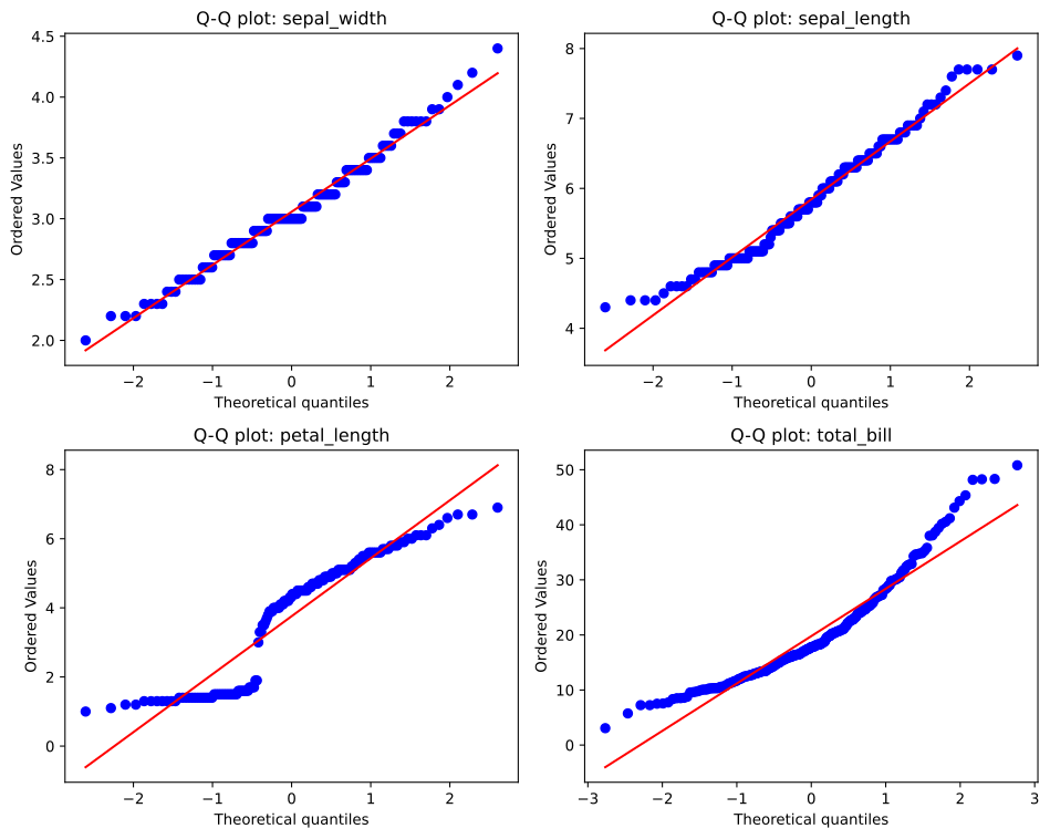
sepal_width hugs the line; its flat steps come from widths measured to one decimal, so many values repeat. sepal_length follows the line in the middle but sits above it at the left end, where the shortest sepals are longer than a normal curve would put them. petal_length breaks into two groups with a jump between them. total_bill bows below the line in the middle and climbs above it at the right end, where the large bills are larger than a normal curve would put them. The r printed for each plot is the correlation of the points with the line: 0.9923, 0.9900, 0.9396 and 0.9592, highest for the two sepal columns.
Testing normality with Shapiro-Wilk
The Shapiro-Wilk test turns the Q-Q picture into a number. Its null hypothesis H₀ is that the data come from a normal distribution; the alternative H₁ is that they do not. The statistic W is close to 1 when the sorted data line up with the normal quantiles and smaller when they do not.
The test reports a p-value: the probability, if the null hypothesis is true, of a W at least as extreme (as small) as the one observed. If the p-value is below a significance level α chosen in advance, usually 0.05, you reject H₀: the data give evidence against normality. If it is above α, you fail to reject H₀: the data are consistent with a normal distribution, which does not prove they are normal. Hypothesis testing and P-value build these ideas in full.
Running scipy.stats.shapiro
from scipy.stats import shapiro

result = shapiro(values)            # values: a 1-D array of data
result.statistic, result.pvalue # W and the p-valuefrom scipy.stats import shapiro, skew
for name, values in columns.items():
w, p = shapiro(values)
decision = "reject H0" if p < 0.05 else "fail to reject H0"
print(f"{name:13} n = {len(values)} skew {skew(values):+.3f} W = {w:.4f} p = {p:.3g} {decision}")sepal_width n = 150 skew +0.316 W = 0.9849 p = 0.101 fail to reject H0 sepal_length n = 150 skew +0.312 W = 0.9761 p = 0.0102 reject H0 petal_length n = 150 skew -0.272 W = 0.8763 p = 7.41e-10 reject H0 total_bill n = 244 skew +1.126 W = 0.9197 p = 3.32e-10 reject H0
What the Shapiro-Wilk results show
- sepal_width: W = 0.9849, p = 0.101. p is above 0.05, so we fail to reject H₀. A W this small would not be unusual if the data were normal; the column is consistent with a normal distribution.
- sepal_length: p = 0.0102. Below 0.05, so reject H₀ at α = 0.05: evidence that sepal_length is not normal, even though its skewness, +0.312, is close to sepal_width's +0.316.
- petal_length: p = 7.41e-10. Reject H₀. Its skewness is only −0.272, so skewness alone misses the two peaks that the histogram and the Q-Q plot show.
- total_bill: p = 3.32e-10. Reject H₀; the skewness of +1.126 and the bent Q-Q plot tell the same story.
Sample size changes what the test can see
A test's verdict depends on how much data it has. Here are two samples drawn with numpy: 15 values from an exponential distribution, which is clearly skewed, and 4000 values from a t distribution with 10 degrees of freedom, a bell with tails only a little heavier than the normal (One-sample t-test and the t distribution covers it).
import numpy as np
from scipy.stats import shapiro

rng = np.random.default_rng(42)
small_skewed = rng.exponential(scale=1, size=15)     # clearly skewed, only 15 values
large_bell = rng.standard_t(df=10, size=4000)        # a bell, slightly heavy tails, 4000 values
for name, x in [("small_skewed", small_skewed), ("large_bell", large_bell)]:
    w, p = shapiro(x)
print(f"{name:12} n = {len(x):4} W = {w:.4f} p = {p:.3g}")small_skewed n = 15 W = 0.9262 p = 0.24 large_bell n = 4000 W = 0.9935 p = 1.61e-12
- The 15 skewed values give p = 0.24, so the test fails to reject H₀. With so few values it has little power to see a departure that is there.
- The 4000 bell-shaped values give p = 1.61e-12, a firm rejection, for a departure too small to matter for most uses.
- So read the p-value with the plot. With small samples, a pass is weak evidence; with large samples, ask whether the departure the Q-Q plot shows is big enough to matter.
Q-Q plot vs Shapiro-Wilk vs skewness
| Q-Q plot | Shapiro-Wilk test | Skewness | |
|---|---|---|---|
| Gives | A picture | W and a p-value | One number |
| Shows | Where the data depart: tails, skew, clusters | Whether the departure is more than chance | Lopsidedness only |
| Small samples | Hard to read | Low power: misses real departures | Noisy |
| Large samples | Clear | Flags tiny, harmless departures | Stable |
| In Python | scipy.stats.probplot, statsmodels qqplot | scipy.stats.shapiro | scipy.stats.skew |
Where you check normality
- Before a t-test or z-test on a small sample. These tests assume roughly normal data or a large n; see One-sample t-test and the t distribution.
- Regression residuals. Linear regression's p-values and intervals assume normal errors; see Linear regression assumptions.
- Choosing a summary or a transform. A clearly skewed column such as total_bill is better described by its median, or log-transformed first; see Log-normal distribution.
Related
- Previous: Z-table and normal probabilities
- Next: Probability basics
- See also: Skewness and kurtosis
- Reference: scipy.stats.shapiro, scipy.stats.probplot
- Run
shapiro(iris[iris["species"] == "setosa"]["petal_length"]): one species alone gives p = 0.0548, above 0.05, because the two peaks came from mixing species. - Change
size=15tosize=60in the sample-size example: with 60 values the exponential sample is rejected. - Draw the Q-Q plot of
np.log(tips["total_bill"])(addimport numpy as np): the upward bend at the right end flattens, and the skewness drops from 1.126 to about −0.12.
Every expert started right here.