
Count plots and bar plots in seaborn
sns.countplot counts the rows of a category itself and draws the bars, while sns.barplot draws bars from numbers you have already worked out, and both take their columns as keyword arguments only.
Last updated: 12 Oct, 2026 · pandas 3.0 · seaborn 0.13 · matplotlib 3.11
Answering a question with groupby produced a frame of counts and pandas drew it. seaborn draws the same thing with a legend, a colour per category and a count it can work out for itself, which is why most charts in the wild are seaborn charts.
Syntax: both functions take data= and then the column names as x=, y= and hue=. A list of colours goes in palette=, and a palette needs a hue, so pass legend=False when the hue repeats the x column.
sns.countplot(data=df, x='Rating text')              # seaborn counts the rows
sns.barplot(data=frame, x='band', y='count')         # you supply the numbers
sns.barplot(data=frame, x='band', y='count',
            hue='colour', palette=['red', 'green'])  # a colour per hue value
sns.countplot(data=df, x='c', hue='c', legend=False) # palette with no extra legend
Loading the Zomato data and seaborn
Every example here starts from the merged Zomato frame. The zip recipe is the one Reading a CSV that is not UTF-8 built, and the join on the country code is the one Merging a lookup table built. Run this block first, then the example under it.
import io, zipfile, urllib.request
import pandas as pd, seaborn as sns
import matplotlib
matplotlib.use('svg')
import matplotlib.pyplot as plt

url = ("https://raw.githubusercontent.com/krishnaik06/"
       "5-Days-Live-EDA-and-Feature-Engineering/main/Zomatodataset.zip")
zf = zipfile.ZipFile(io.BytesIO(urllib.request.urlopen(url).read()))
with zf.open('zomato.csv') as fh:
    df = pd.read_csv(fh, encoding='latin-1')
with zf.open('Country-Code.xlsx') as fh:
    codes = pd.read_excel(fh)
df = pd.merge(df, codes, on='Country Code', how='left')
The positional call that used to work
Until seaborn 0.12 the columns could be passed as the first two positional arguments, so older code reads sns.barplot('band', 'count', data=frame). The signature now takes data first, so the old line hands data twice and raises. It is the most common error when running a notebook from that era.
import pandas as pd
import seaborn as sns

frame = pd.DataFrame({'band': ['Poor', 'Average'], 'count': [186, 3737]})
sns.barplot('band', 'count', data=frame)Traceback (most recent call last):
File "main.py", line 5, in <module>
sns.barplot('band', 'count', data=frame)
TypeError: barplot() got multiple values for argument 'data'The fix is to name them: sns.barplot(data=frame, x='band', y='count'). The same change applies to countplot, boxplot and the rest of the axes level functions.
Drawing counts you worked out yourself
barplot expects one row per bar, with the label in one column and the height in another. The groupby that produced the rating bands gives exactly that, one row per aggregate rating. hue='Rating color' colours each bar by the band it belongs to, and dodge=False keeps the bars in one row rather than splitting them per hue.
ratings = (df.groupby(['Aggregate rating', 'Rating color'])
             .size().reset_index().rename(columns={0: 'Rating Count'}))
print(ratings.head(4).to_string(index=False))
print("bars to draw:", len(ratings))

colours = {'White': 'blue', 'Red': 'red', 'Orange': 'orange',
           'Yellow': 'yellow', 'Green': 'green', 'Dark Green': 'darkgreen'}
fig, ax = plt.subplots(figsize=(10, 4))
sns.barplot(data=ratings, x='Aggregate rating', y='Rating Count',
            hue='Rating color', palette=colours, dodge=False, ax=ax)
ax.set_title('How many restaurants hold each aggregate rating')
fig.savefig('chart.svg') Aggregate rating Rating color Rating Count
0.0 White 2148
1.8 Red 1
1.9 Red 2
2.0 Red 7
bars to draw: 33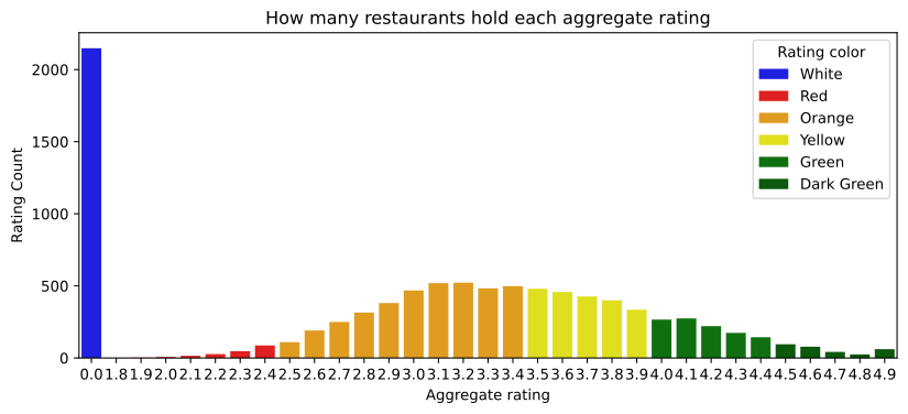
What the coloured bars show that the band chart did not
- The blue bar at 0.0 is a column of its own. 2,148 restaurants with no rating sit at zero, separated from every rated restaurant by a gap from 0.1 to 1.7.
- The rated restaurants form one hump. It rises from 1.8, peaks in the orange Average band and falls away through green to dark green.
- The colours are the data's own.
Rating coloris a column in the table, so the palette maps a real category to a real colour rather than decorating the chart.
The hump is not a bell curve. It is one hump with a long tail and a spike standing outside it, which is the kind of shape Distributions with histograms, KDE and box plots measures properly.
Letting seaborn do the counting
countplot takes the raw frame and counts the rows per category itself, so no groupby is needed. order= fixes the order of the bars, which otherwise follows the order the values appear in the data. Passing hue the same column as x gives one colour per bar, and legend=False drops the legend that would then repeat the axis labels.
order = ['Not rated', 'Poor', 'Average', 'Good', 'Very Good', 'Excellent']
print(df['Rating text'].value_counts()[order].to_string())

fig, ax = plt.subplots(figsize=(7, 4))
sns.countplot(data=df, x='Rating text', order=order,
              hue='Rating text', hue_order=order, legend=False, ax=ax)
ax.set_title('Restaurants per rating band, counted by seaborn')
fig.savefig('chart.svg')Rating text Not rated 2148 Poor 186 Average 3737 Good 2100 Very Good 1079 Excellent 301
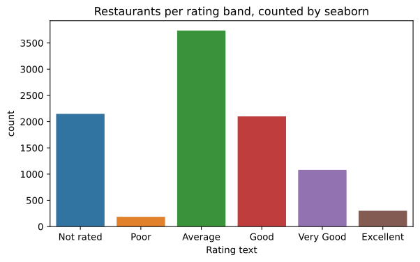
The bars are the same six numbers the first chart of this part drew with pandas. What seaborn adds is the counting, the ordering and the colour per category; what it costs is a dependency and a signature that changed.
countplot vs barplot
countplot | barplot | |
|---|---|---|
| You supply | the raw frame and one column | a frame of labels and heights |
| Bar height is | the number of rows | the mean of y per x, or the single value you give it |
| Error bars | none | drawn by default; pass errorbar=None to remove them |
| Order of bars | order= or the order found in the data | order= or the order of the rows |
| Use it for | how many rows per category | a number you have already summarised |
The error bars are the surprise in barplot: given several rows per x value it averages them and draws a confidence interval. One row per x value, as above, leaves nothing to average and no interval is drawn.
Where seaborn is the better choice
- A category coloured by a second category.
huedoes in one argument what an unstack and a grouped bar chart do in three lines. - A chart for a report. The default theme, axis labels and legend are closer to publishable than the matplotlib defaults.
- Counting without summarising first.
countploton a raw column is the fastest look at a categorical feature's balance, which is what What imbalance does to a model starts from.
palette= without a hue warns in seaborn 0.13 and stops working in 0.14. Assign the same column to hue and pass legend=False to keep the colours and lose the duplicate legend. The same release removed positional x and y, so every seaborn call in old code needs its arguments named.Related
- Previous: Answering a question with groupby
- Next: Distributions with histograms, KDE and box plots
- See also: Pie and bar charts with a top-N trim
- Reference: seaborn.countplot and seaborn.barplot
- Remove
dodge=Falsefrom the bar plot and read what happens to the bar widths. - Draw
sns.countplot(data=df, x='Price range')and write the one sentence it supports. - Add
hue='Has Online delivery'to the count plot ofPrice rangeand read which price range delivers most.
Every expert started right here.