
The IQR fence
The IQR fence calls a value an outlier when it falls outside Q1 minus 1.5 times the IQR or Q3 plus 1.5 times the IQR, where the IQR is the distance between the 25th and the 75th percentile of the column.
Last updated: 12 Oct, 2026 · pandas 3.0 · scikit-learn 1.9
Finding outliers with the z score ended on a column the mean and the standard deviation could not handle. The fence is built from positions in the sorted column instead, so the values it is testing cannot move it.
Syntax: two quantiles, their difference, and the two boundaries.
q1, q3 = s.quantile(0.25), s.quantile(0.75)   # the two percentiles
iqr = q3 - q1                                 # the interquartile range
lower, upper = q1 - 1.5 * iqr, q3 + 1.5 * iqr  # the fence
Fencing the 34 readings
The two percentiles and the range between them
Q1 is the value a quarter of the way up the sorted column and Q3 the value three quarters of the way up. The distance between them, the IQR, covers the middle half of the column and says nothing about either tail.
q1, q3 = np.percentile(readings, [25, 75])
iqr = q3 - q1
The fence, 1.5 IQRs out from each end of the box
The 1.5 is the convention Tukey chose when he designed the box plot. It is not derived from a distribution; it is the multiplier that flags a small number of values on most real columns.
lower = q1 - 1.5 * iqr
upper = q3 + 1.5 * iqr
Running the fence on the readings
import numpy as np

readings = [11, 10, 12, 14, 12, 15, 14, 13, 15, 102, 12, 14, 17, 19, 107,
            10, 13, 12, 14, 12, 108, 12, 11, 14, 13, 15, 10, 15, 12, 10, 14, 13, 15, 10]

q1, q3 = np.percentile(readings, [25, 75])
iqr = q3 - q1
lower = q1 - 1.5 * iqr
upper = q3 + 1.5 * iqr

print("Q1:", q1, " Q3:", q3, " IQR:", iqr)
print("fence:", lower, "to", upper)
print("outliers:", [v for v in readings if v < lower or v > upper])Q1: 12.0 Q3: 15.0 IQR: 3.0 fence: 7.5 to 19.5 outliers: [102, 107, 108]
What the fence found
- Q1 is 12.0 and Q3 is 15.0. Half of the 34 readings sit in a band three units wide.
- The IQR is 3.0. Neither percentile was touched by the three far values, because moving a value from 17 to 108 does not change which value sits three quarters of the way up the sorted column.
- The fence runs from 7.5 to 19.5. That is 1.5 times 3.0 added to each end of the box.
- 102, 107 and 108 fall outside it. The same three the z score found, this time from a rule the three of them had no hand in setting.
What a box plot draws
A box plot is this calculation turned into a picture. The box is Q1 to Q3, the line inside it is the median, the whiskers reach to the furthest value still inside the fence, and anything past them is drawn as its own point.
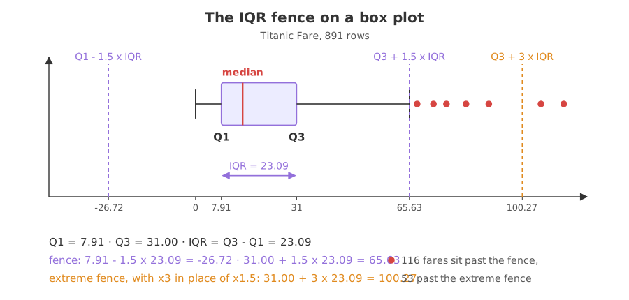
The whiskers are not the fence. A whisker stops at a real value in the column; the fence is the line it was not allowed to pass. On a column with no outliers the whisker stops short of the fence, and the picture has no points outside it at all.
The fence on Titanic Fare
Fare is the column the z score gave up on. Here the fence and the box plot agree with each other and with what the column looks like.
import matplotlib
matplotlib.use("svg")
import matplotlib.pyplot as plt
import pandas as pd

URL = ("https://raw.githubusercontent.com/krishnaik06/Feature-Engineering-Live-sessions/"
       "master/titanic.csv")
fare = pd.read_csv(URL)["Fare"]

q1, q3 = fare.quantile(0.25), fare.quantile(0.75)
iqr = q3 - q1
upper = q3 + 1.5 * iqr
extreme = q3 + 3 * iqr         # the extreme-outlier multiplier
print("Q1:", q1, " Q3:", q3, " IQR:", round(iqr, 4))
print("fence:", q1 - 1.5 * iqr, "to", upper)
print("extreme fence:", q1 - 3 * iqr, "to", extreme)
print("past the fence:", int((fare > upper).sum()),
      " past the extreme fence:", int((fare > extreme).sum()))

fig, ax = plt.subplots(figsize=(7, 2.4))
ax.boxplot(fare, orientation="horizontal", widths=0.5)
ax.axvline(upper, color="#9370DB", linestyle="--", label="Q3 + 1.5 x IQR")
ax.axvline(extreme, color="#e08a1e", linestyle="--", label="Q3 + 3 x IQR")
ax.set_yticks([])
ax.set_xlabel("Fare")
ax.legend()
fig.savefig("chart.svg")Q1: 7.9104 Q3: 31.0 IQR: 23.0896 fence: -26.724 to 65.6344 extreme fence: -61.358399999999996 to 100.2688 past the fence: 116 past the extreme fence: 53
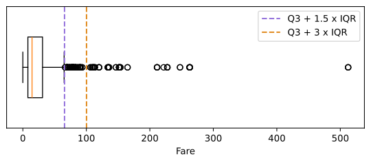
Reading the Fare box plot
- The box is 7.91 to 31.00. Half of all passengers paid between those two fares, and the median fare was 14.45.
- The fence is 65.63. That is 31.00 plus 1.5 times 23.09. The lower end is minus 26.72, below the minimum of 0, so nothing can fall outside it.
- 116 fares sit past the fence. 13% of the column. On a skewed column that is normal, and it is why a box plot of a skewed column always looks like this.
- The extreme fence is 100.27. Changing the multiplier from 1.5 to 3 moves the line out and leaves 53 rows outside it. The two multipliers are the two strengths of the same rule.
116 flagged rows is not a list of 116 errors. It is a list of 116 passengers who paid a lot, most of whom travelled first class. A rule that flags an eighth of the column is telling you the column is skewed, which is a reason to transform it rather than to cut it.
1.5 IQR vs 3 IQR
| Q3 + 1.5 x IQR | Q3 + 3 x IQR | |
|---|---|---|
| Called | outlier | extreme outlier |
| Fence on Titanic Fare | 65.63 | 100.27 |
| Rows past it | 116 of 891 | 53 of 891 |
| Drawn by a box plot | yes, it sets the whiskers | no, you draw it yourself |
| Use it to | spot the tail of a column | find the handful of rows worth reading |
Where the fence is the right rule
- Skewed money columns. Price, income, fare and order value all have a long right tail, which is exactly where the z score stops working.
- A first pass on a column you know nothing about. The fence needs no assumption about the shape, so it is the safe default before the shape has been checked.
- Setting a cap. The fence is a defensible value to cap a column at, which is what the next lesson does with it.
Related
- Previous: Finding outliers with the z score
- Next: Treating outliers by capping or dropping
- See also: Distributions with histograms, KDE and box plots
- Reference: pandas.Series.quantile
- Change the 1.5 in the readings example to 3 and print the fence again. The three far values are still outside it.
- Run the fence on the
Agecolumn and compare the two boundaries with the -13.88 and 73.28 the z score produced. - Pass
whis=3toax.boxplotand count how many circles are left outside the whisker.
This is what real progress feels like.