
Pie and bar charts with a top-N trim
A pie chart shows how one whole is divided between a few categories, and a top-N trim keeps only the largest few of them, which makes the chart readable and changes what its percentages mean.
Last updated: 12 Oct, 2026 · pandas 3.0 · seaborn 0.13 · matplotlib 3.11
Counting categories with value_counts produced a Series of counts with the labels in its index. Both chart types here are drawn straight from that Series, and both have a trap in them.
Syntax: ax.pie(values, labels=..., autopct=...) draws a pie from a list of numbers. autopct='%1.2f%%' writes each slice's percentage with two decimals. Series.plot.bar(ax=...) draws the same numbers as bars.
counts = df['City'].value_counts()      # a Series, biggest first
ax.pie(counts.values, labels=counts.index)          # every category
ax.pie(counts.values[:5], labels=counts.index[:5],  # the five biggest
       autopct='%1.2f%%')
counts.head(5).plot.bar(ax=ax)           # the same five as bars
Loading the Zomato data
Every example here starts from the merged Zomato frame. The zip recipe is the one Reading a CSV that is not UTF-8 built, and the join on the country code is the one Merging a lookup table built. Run this block first, then the example under it.
import io, zipfile, urllib.request
import pandas as pd
import matplotlib
matplotlib.use('svg')
import matplotlib.pyplot as plt

url = ("https://raw.githubusercontent.com/krishnaik06/"
       "5-Days-Live-EDA-and-Feature-Engineering/main/Zomatodataset.zip")
zf = zipfile.ZipFile(io.BytesIO(urllib.request.urlopen(url).read()))
with zf.open('zomato.csv') as fh:
    df = pd.read_csv(fh, encoding='latin-1')
with zf.open('Country-Code.xlsx') as fh:
    codes = pd.read_excel(fh)
df = pd.merge(df, codes, on='Country Code', how='left')
Drawing every category, and why it fails
The honest first attempt is to give the pie every category. Zomato's table covers 15 countries, and 14 of them are small. The chart is drawn correctly and is of no use: the small slices collapse into slivers and their labels overlap into a grey smear.
counts = df['Country'].value_counts()
print("slices to draw:", len(counts))
print("smallest four counts:", counts.tail(4).to_dict())

fig, ax = plt.subplots(figsize=(6, 5))
ax.pie(counts.values, labels=counts.index)
ax.set_title('Records per country, all 15 countries')
fig.savefig('chart.svg')slices to draw: 15
smallest four counts: {'Singapore': 20, 'Qatar': 20, 'Sri Lanka': 20, 'Canada': 4}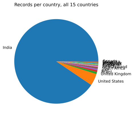
Canada is 4 rows, and Singapore, Qatar and Sri Lanka are 20 each. No circle can show a slice of 4 next to India's 8,652. The chart is not wrong; the question was wrong, because it asked for 15 answers from a picture that can carry about five.
Trimming to the top five
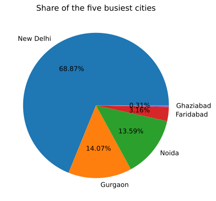
Slicing the Series with head(5) keeps the five biggest groups. Here the question moves to cities, where the trim is the difference between a readable chart and a smear: the table has 141 cities. autopct writes the percentage inside each slice.
cities = df['City'].value_counts().head(5)
print("cities in the table:", df['City'].nunique())
print(cities.to_string())
print()
print("share of these five cities, in percent:")
print((cities / cities.sum() * 100).round(2).to_string())

fig, ax = plt.subplots(figsize=(6, 5))
ax.pie(cities.values, labels=cities.index, autopct='%1.2f%%')
ax.set_title('Share of the five busiest cities')
fig.savefig('chart.svg')cities in the table: 141 City New Delhi 5473 Gurgaon 1118 Noida 1080 Faridabad 251 Ghaziabad 25 share of these five cities, in percent: City New Delhi 68.87 Gurgaon 14.07 Noida 13.59 Faridabad 3.16 Ghaziabad 0.31
What the percentages on a trimmed pie mean
The slices read 68.87, 14.07, 13.59, 3.16 and 0.31, and they add up to 100. They are shares of the five cities drawn, not of the dataset, because pie divides each value by the sum of the values it was given. New Delhi is 68.87 percent of these five cities and 57.30 percent of all 9,551 rows. Both numbers are right and they answer different questions.
cities = df['City'].value_counts().head(5)
print("share of the five drawn, in percent:")
print((cities / cities.sum() * 100).round(2).to_string())
print()
print("share of all", len(df), "rows, in percent:")
print((cities / len(df) * 100).round(2).to_string())
print()
print("rows left out of the chart:", int(len(df) - cities.sum()))share of the five drawn, in percent: City New Delhi 68.87 Gurgaon 14.07 Noida 13.59 Faridabad 3.16 Ghaziabad 0.31 share of all 9551 rows, in percent: City New Delhi 57.30 Gurgaon 11.71 Noida 11.31 Faridabad 2.63 Ghaziabad 0.26 rows left out of the chart: 1604
- New Delhi is 68.87 percent of the trim and 57.30 percent of the table. Say which denominator a percentage uses whenever the chart does not show every row.
- 1,604 rows are not in the chart. They are the other 136 cities, and a reader cannot tell from the pie that they exist.
- A trimmed pie needs a title that says it is trimmed. The title above names the five busiest cities, which is the claim the chart can support.
The same counts as bars
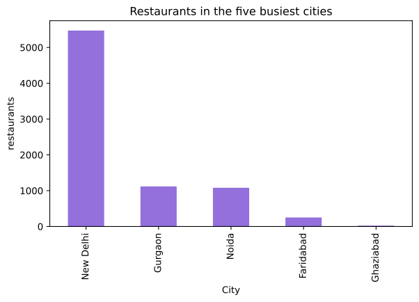
A bar chart needs no trim to stay readable and it keeps a scale, so a reader can see that New Delhi is five times Gurgaon rather than guessing from an angle. The cost is that the shares are no longer written on the chart.
cities = df['City'].value_counts().head(5)

fig, ax = plt.subplots(figsize=(7, 4))
cities.plot.bar(ax=ax, color='#9370DB')
ax.set_ylabel('restaurants')
ax.set_title('Restaurants in the five busiest cities')
print("tallest bar:", int(cities.max()), "   shortest bar:", int(cities.min()))
fig.savefig('chart.svg')tallest bar: 5473 shortest bar: 25
Pie chart vs bar chart
| Pie chart | Bar chart | |
|---|---|---|
| Reads | shares of one whole | amounts on a scale |
| Categories it can carry | about five | twenty or more |
| Shows the actual counts | no, percentages | yes, on the axis |
| Needs a top-N trim | almost always | rarely |
| Breaks when | the categories are many or nearly equal | the labels are long, so use plot.barh() |
| Good for | two or three shares in a report | comparing counts and spotting a dominant group |
Where the trim is the right move
- A column with a long tail. 141 cities, 1,825 cuisine listings: the top five or ten carry the story and the rest is noise.
- A chart for a slide. Five slices with their percentages is a chart someone can read in two seconds.
- Before encoding a high cardinality column. The same top-N idea becomes a feature engineering technique in One hot encoding with many categories.
pie normalises whatever values it is handed. A slice labelled 68.87 percent on a trimmed pie is not 68.87 percent of the dataset. Either put the trim in the title, or add a slice for the rest with counts.head(5).tolist() + [counts[5:].sum()].Related
- Previous: Counting categories with value_counts
- Next: Answering a question with groupby
- See also: Count plots and bar plots in seaborn
- Reference: Axes.pie in the matplotlib docs
- Change
head(5)tohead(3)in the city pie and read how the percentages move. - Add a slice for everything else: build the values as
list(cities.values) + [len(df) - cities.sum()]with a label of'other cities', and compare the percentages with the trimmed pie's. - Draw the cuisine counts as a pie with 10 slices and decide whether the horizontal bar chart was the better answer.
Slow is fine. Stopping is the only problem.