
End of distribution imputation
End of distribution imputation fills every gap with a value taken from the far tail of the column, usually the mean plus three standard deviations, so the filled rows sit apart from the real ones and a model can tell them from the rest without a second column.
Last updated: 12 Oct, 2026 · pandas 3.0
Capturing NaN with an indicator column kept the missingness signal by adding a column. This technique keeps the same signal inside the column that was filled, by choosing a fill value that no real row would have.
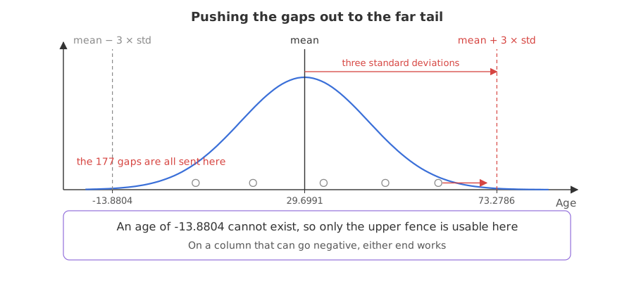
Syntax: the fill value is df['Age'].mean() + 3 * df['Age'].std(), and the fill itself is an ordinary fillna. The three is a convention borrowed from the normal distribution, where about 99.7 percent of values lie within three standard deviations of the mean.
mean, std = df['Age'].mean(), df['Age'].std()
upper = mean + 3 * std            # the far right tail
lower = mean - 3 * std            # the far left tail
df['Age_end'] = df['Age'].fillna(upper)
Loading the Titanic data
The Titanic table is 891 passengers. Age is missing for 177 of them, Cabin for 687 and Embarked for 2, which makes it the right table to learn these techniques on. It loads from its GitHub URL, so there is nothing to download. Run this block first, then the example under it.
import pandas as pd
import matplotlib
matplotlib.use('svg')
import matplotlib.pyplot as plt

url = ("https://raw.githubusercontent.com/krishnaik06/"
       "Feature-Engineering-Live-sessions/master/titanic.csv")
df = pd.read_csv(url, usecols=['Survived', 'Age', 'Fare'])
Working out the two fences
Both ends are computed, and then the data decides which is usable. An age of -13.8804 does not exist, so the lower fence is useless here and the upper one is the fill value. On a column that can go negative, either end works.
mean, std = df['Age'].mean(), df['Age'].std()
upper = mean + 3 * std
lower = mean - 3 * std
print(f"mean {mean:.4f}   std {std:.4f}")
print(f"lower fence {lower:.4f}   upper fence {upper:.4f}")
print("recorded ages above the upper fence:", int((df['Age'] > upper).sum()))
print("recorded ages below the lower fence:", int((df['Age'] < lower).sum()))mean 29.6991 std 14.5265 lower fence -13.8804 upper fence 73.2786 recorded ages above the upper fence: 2 recorded ages below the lower fence: 0
- The upper fence is 73.2786. Two recorded passengers are older than that, so the fill value lands in a region the column does reach, but hardly.
- The lower fence is -13.8804. Nothing can be there, which is the usual outcome for a quantity that cannot be negative.
- The fill value is not an outlier by accident. It is chosen to be one, so that anything reading the column can separate the filled rows.
What the fill does to the histogram
Filling 177 rows with 73.2786 puts a bar at the right hand end of the chart that is taller than anything in the hump. The rest of the shape is untouched, which is the point: the real data keeps its form and the invented rows stand to one side.
upper = df['Age'].mean() + 3 * df['Age'].std()
df['Age_end'] = df['Age'].fillna(upper)
print("fill value:", round(upper, 4))
print("passengers now above 73:", int((df['Age_end'] > 73).sum()))

fig, axes = plt.subplots(1, 2, figsize=(11, 4), sharey=True)
df['Age'].hist(bins=50, ax=axes[0], color='#3a6fd8')
axes[0].set_title('Age, the 714 recorded')
df['Age_end'].hist(bins=50, ax=axes[1], color='#d64541')
axes[1].set_title('Age after end of distribution imputation')
for a in axes:
    a.set_xlabel('Age')
fig.savefig('chart.svg')fill value: 73.2786 passengers now above 73: 179
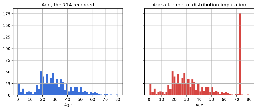
179 passengers now sit above 73, against the two that did before. A model that splits on Age can isolate those rows with one cut, which is how the missingness survives inside a single column.
The side effect on an outlier check
The filled rows are deliberate outliers, so every outlier measure taken after this step changes. A box plot of the result is the clearest view of it: the box grows, the fences move outwards, and the points that used to be drawn beyond the whisker are swallowed.
upper = df['Age'].mean() + 3 * df['Age'].std()
df['Age_end'] = df['Age'].fillna(upper)
df['Age_median'] = df['Age'].fillna(df['Age'].median())
for name in ['Age', 'Age_median', 'Age_end']:
    q1, q3 = df[name].quantile([0.25, 0.75])
    print(f"{name:11s} box {q1:7.4f} to {q3:7.4f},"
          f" whisker reaches {q3 + 1.5 * (q3 - q1):8.4f}")

fig, ax = plt.subplots(figsize=(7, 4))
df.boxplot(column=['Age', 'Age_median', 'Age_end'], ax=ax)
ax.set_title('The same column, three ways')
fig.savefig('chart.svg')Age box 20.1250 to 38.0000, whisker reaches 64.8125 Age_median box 22.0000 to 35.0000, whisker reaches 54.5000 Age_end box 22.0000 to 54.0000, whisker reaches 102.0000
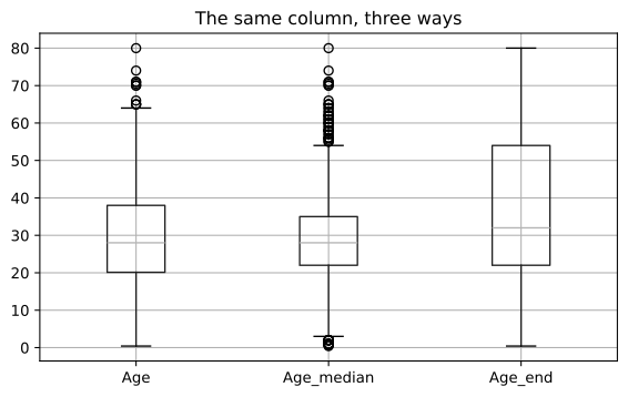
- The box grows from 20.1250 to 38.0000 into 22.0000 to 54.0000. The third quartile moves because 177 rows were added at the top of the range.
- The whisker now reaches 102.0000, where it reached 64.8125 before. The two two oldest passengers are no longer drawn as separate points.
- Nothing is an outlier any more. That is the technique working as designed and a trap if you then run an outlier check and conclude the column is clean.
- Median imputation moves the same fence the other way. Its box shrinks to 22.0000 to 35.0000 and its whisker reaches only 54.5000, so ages that were ordinary before are now drawn as outliers.
End of distribution vs median vs indicator
| Median imputation | End of distribution | Indicator plus fill | |
|---|---|---|---|
| Fill value | the middle of the column | the far tail | the middle, plus a flag column |
| Extra columns | none | none | one per filled column |
| Missingness recoverable | no | yes, by its value | yes, from the flag |
| Distorts the spread | shrinks it | stretches it | shrinks it |
| Breaks outlier checks | no | yes | no |
| Use when | the gaps are random and few | the gaps carry meaning and no extra column is wanted | the gaps carry meaning |
Where this technique is the right one
- Tree based models. A tree can split off the far tail in one cut, so the filled rows are separated with no extra feature.
- A wide table where indicators would double the columns. The signal is kept without adding anything.
- A column whose gaps you suspect are informative, which is the MNAR case from Why values go missing.
Related
- Previous: Capturing NaN with an indicator column
- Next: Arbitrary value imputation
- See also: Finding outliers with the z score
- Reference: Series.std in the pandas docs
- Change the 3 to a 2 and read how far the fill value moves.
- Fill with the lower fence instead and check what a negative age does to
describe(). - Run the same calculation on
Fareand compare the fence with its real maximum of 512.3292.
You understood something today that you didn't yesterday.