
Project: the EDA pass
The EDA pass is the census you run once on the training rows before building anything: how much is missing, what type each column is, how many labels it carries, and which columns move the price.
Last updated: 12 Oct, 2026 · pandas 3.0 · scikit-learn 1.9
Project: the house price data left 1,314 training houses and 79 columns. That is far too many to read one by one, so this pass asks four questions of all of them at once, and every answer decides a step in the feature pass that follows.
Counting the gaps, the types and the labels
Four censuses, each one line of pandas. The share of nulls per column, the split into numbers and text, the split of the numbers into discrete and continuous by how many distinct values they hold, and the number of labels in each text column.
share = X_train.isnull().mean()
share = share[share > 0].sort_values(ascending=False)numbers = X_train.select_dtypes(include='number').columns
words = X_train.select_dtypes(include='str').columns
years = [c for c in numbers if 'Yr' in c or 'Year' in c]# fewer than 25 distinct values and not a year: treat it as a step, not a measurement
discrete = [c for c in numbers if X_train[c].nunique() < 25 and c not in years]Running the four censuses
import numpy as np
import pandas as pd
from sklearn.model_selection import train_test_split

AMES = ("https://raw.githubusercontent.com/krishnaik06/"
        "Advanced-House-Price-Prediction-/master/train.csv")
houses = pd.read_csv(AMES)
y = np.log(houses['SalePrice'])
X = houses.drop(columns=['Id', 'SalePrice'])
X_train, X_test, y_train, y_test = train_test_split(
    X, y, test_size=0.1, random_state=0)

share = X_train.isnull().mean()
share = share[share > 0].sort_values(ascending=False)
print("columns with a null:", len(share))
print(share.round(4).to_string())
numbers = X_train.select_dtypes(include='number').columns
words = X_train.select_dtypes(include='str').columns
print("numeric:", len(numbers), "text:", len(words))
years = [c for c in numbers if 'Yr' in c or 'Year' in c]
print("year columns:", years)
discrete = [c for c in numbers if X_train[c].nunique() < 25 and c not in years]
print("discrete:", len(discrete), "continuous:", len(numbers) - len(discrete) - len(years))
card = X_train[words].nunique().sort_values(ascending=False)
print("widest text columns:")
print(card.head(5).to_string())
print("text columns with 2 or 3 labels:", int((card <= 3).sum()))columns with a null: 19 PoolQC 0.9954 MiscFeature 0.9612 Alley 0.9384 Fence 0.8143 MasVnrType 0.6012 FireplaceQu 0.4726 LotFrontage 0.1773 GarageType 0.0563 GarageYrBlt 0.0563 GarageFinish 0.0563 GarageQual 0.0563 GarageCond 0.0563 BsmtFinType2 0.0251 BsmtExposure 0.0251 BsmtFinType1 0.0244 BsmtCond 0.0244 BsmtQual 0.0244 MasVnrArea 0.0046 Electrical 0.0008 numeric: 36 text: 43 year columns: ['YearBuilt', 'YearRemodAdd', 'GarageYrBlt', 'YrSold'] discrete: 17 continuous: 15 widest text columns: Neighborhood 25 Exterior2nd 16 Exterior1st 15 SaleType 9 Condition1 9 text columns with 2 or 3 labels: 9
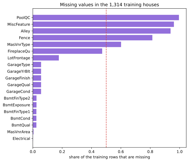
- 19 columns have a gap, and they are nothing like each other.
PoolQCis missing for 99.5 percent of the training houses because almost no house has a pool, whileElectricalis missing once. Those two need different answers. - Five columns are missing for more than half the houses.
PoolQC,MiscFeature,Alley,FenceandMasVnrType. For a quality grade, the gap means the house has no pool and no alley, so the absence is the information and deleting the column throws it away. - The five garage columns go missing together, all at 0.0563. One cause, no garage, showing up in five places. The five basement columns behave the same way at about 0.025.
- 36 numbers and 43 text columns. Among the numbers, four are years, 17 are discrete counts such as the number of bedrooms, and 15 are measurements.
- Neighborhood carries 25 labels and nine columns carry two or three. That range is why one encoder for everything is the wrong answer.
Charting the gaps instead of reading them
The same shares as a horizontal bar chart. A chart of nulls as a grid of cells, one per value, runs to megabytes of SVG on a table this size and is no easier to read; the share per column is the number you act on. The missing value map builds the same chart on a smaller table.
import matplotlib
matplotlib.use('svg')
import matplotlib.pyplot as plt

share = X_train.isnull().mean()
share = share[share > 0].sort_values()
print("highest:", share.index[-1], round(float(share.iloc[-1]), 4))
print("lowest :", share.index[0], round(float(share.iloc[0]), 4))

fig, ax = plt.subplots(figsize=(7, 6))
ax.barh(share.index, share.values, color='#9370DB')
ax.axvline(0.5, color='#d64541', linestyle='--', linewidth=1.2)
ax.set_xlabel('share of the training rows that are missing')
ax.set_title('Missing values in the 1,314 training houses')
fig.tight_layout()
fig.savefig('chart.svg')highest: PoolQC 0.9954 lowest : Electrical 0.0008
Asking which columns move the price
A census says what the columns are. The last question is which of them matter. Two charts answer most of it: the median price per level of the overall quality score, and the living area against the price with both on a log scale.
import matplotlib
matplotlib.use('svg')
import matplotlib.pyplot as plt

train = X_train.assign(logprice=y_train)
by_quality = train.groupby('OverallQual')['logprice'].median()
print(by_quality.round(4).to_string())
print("correlation of log(GrLivArea) with the log price:",
      round(float(np.log(train['GrLivArea']).corr(train['logprice'])), 4))

fig, axes = plt.subplots(1, 2, figsize=(11, 4))
axes[0].plot(by_quality.index, by_quality.values, 'o-', color='#9370DB')
axes[0].set_xticks(list(by_quality.index))
axes[0].set_xlabel('OverallQual')
axes[0].set_ylabel('median log price')
axes[0].set_title('Price rises with the quality score')
axes[1].plot(np.log(train['GrLivArea']), train['logprice'], 'o',
             markersize=3, color='#3a6fd8', alpha=0.45)
axes[1].set_xlabel('log(GrLivArea)')
axes[1].set_ylabel('log price')
axes[1].set_title('A straight line after the log')
fig.tight_layout()
fig.savefig('chart.svg')OverallQual 1 10.7988 2 11.0021 3 11.3649 4 11.5899 5 11.7981 6 11.9782 7 12.2150 8 12.5015 9 12.7513 10 12.9770 correlation of log(GrLivArea) with the log price: 0.7261
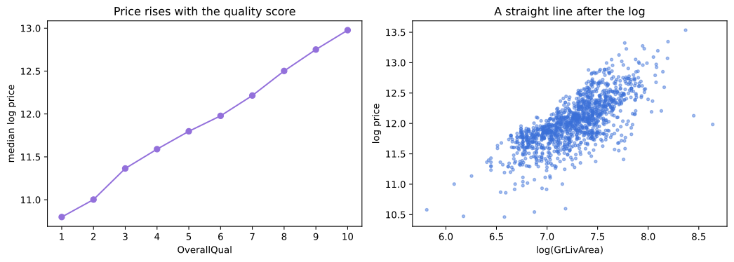
- OverallQual rises without a break. Ten levels, ten medians, each above the one before. A column that behaves like that is worth keeping as a number rather than splitting into dummies.
- The log of the living area correlates 0.7261 with the log price. On the raw scale the cloud fans out; after both logs it is close to a straight line, which is what a linear model fits well.
- Both charts are drawn from the training rows. Choosing which columns to treat specially after looking at the held back houses is a choice made with every row, which Data leakage counts as the third door.
What each answer decides
| What the pass found | What it decides in the feature pass |
|---|---|
| PoolQC, Alley, Fence missing for most houses | fill with the label Missing, not with the mode |
| Three numeric columns with gaps | fill with the training median and add a flag column |
| Four year columns | turn each into an age by subtracting from YrSold |
| Four heavily skewed measurements | take the log |
| Neighborhood with 25 labels, nine columns with two | group the rare labels, then one code per label |
| Columns on wildly different scales | min max scale everything at the end |
| OverallQual ordered and GrLivArea straight after a log | leave both as numbers and let the model use them |
Where this pass pays for itself
- Any table you did not create. Twenty minutes of census is cheaper than discovering at model time that six columns go missing together.
- Any table with more columns than you can read. The four questions scale: they are the same four lines whether the table has 20 columns or 800.
- Any handover. The census output is the shortest honest description of a dataset you can hand to somebody else.
X_train feels harmless, because you are looking rather than fitting. It is harmless until a decision comes out of it, and every row in the table above is a decision.Related
- Previous: Project: the house price data
- Next: Project: building the features
- See also: The first look at a dataset
- Reference: DataFrame.select_dtypes in the pandas documentation
- Change the cardinality cut from
< 25to< 10and count the discrete columns again. Seventeen becomes ten, which shows that the line between a count and a measurement is a choice, not a fact. - Group by
Neighborhoodinstead ofOverallQualand plot the median log price. Twenty five bars, and the spread between them is why the neighbourhood survives the selection. - Print the null count per row across the garage columns with
X_train.filter(like='Garage').isnull().sum(axis=1).value_counts(). It prints 1,240 rows at zero and 74 at five, with nothing in between: a house either has a garage or it does not.
Slow is fine. Stopping is the only problem.