
Relationships between features
A relationship between two numeric features is whether knowing one tells you anything about the other, read from a scatter plot for one pair, a pair plot for every pair at once, and a correlation heatmap for the strength of each pair as a number.
Last updated: 12 Oct, 2026 · pandas 3.0 · seaborn 0.13 · matplotlib 3.11
Distributions with histograms, KDE and box plots read one column at a time. A model is interested in pairs: a feature that moves with the target is worth keeping, and two features that move with each other carry the same information twice.
Syntax: ax.plot(x, y, 'o') or ax.scatter(x, y) draws one pair, sns.pairplot(frame) draws every pair, and df.corr(numeric_only=True) computes Pearson correlation for each pair, which sns.heatmap(..., annot=True) prints into coloured squares.
df.corr(numeric_only=True)                 # a square frame of correlations
sns.heatmap(corr, annot=True, fmt='.2f', cmap='RdYlGn', ax=ax)
ax.plot(df['Age'], df['Fare'], 'o')        # one pair, one dot per row
sns.pairplot(frame, corner=True)           # every pair, plus a density per column
df['Age'].corr(df['Fare'])                 # one number for one pair
Loading the Titanic data
These examples use every column of the Titanic table, text columns included, because the first thing to go wrong involves them. Run this block first, then the example under it.
import pandas as pd
import matplotlib
matplotlib.use('svg')
import matplotlib.pyplot as plt

url = ("https://raw.githubusercontent.com/krishnaik06/"
       "Feature-Engineering-Live-sessions/master/titanic.csv")
df = pd.read_csv(url)
The call that fails on a text column
corr() multiplies numbers together, so it has nothing to do with a passenger's name. Until pandas 2.0 it quietly dropped the text columns. It now refuses, and the message names the first value it could not turn into a number.
import pandas as pd

url = ("https://raw.githubusercontent.com/krishnaik06/"
       "Feature-Engineering-Live-sessions/master/titanic.csv")
df = pd.read_csv(url)
df.corr()Traceback (most recent call last):
File "main.py", line 6, in <module>
df.corr()
ValueError: could not convert string to float: 'Braund, Mr. Owen Harris'numeric_only=True is the fix, and it is worth passing even on an all numeric frame: it says what you meant, and it keeps working when a text column arrives later.
Correlation for every pair at once
corr(numeric_only=True) returns a square frame with one row and one column per numeric feature. Each cell is Pearson correlation, between -1 and 1: 1 means the two rise together in a straight line, -1 means one rises as the other falls, and 0 means no straight line relationship. The diagonal is 1 because every column agrees with itself.
corr = df.corr(numeric_only=True)
print("numeric columns compared:", corr.shape[0])
print()
print(corr['Survived'].round(3).sort_values().to_string())

fig, ax = plt.subplots(figsize=(7, 5.5))
sns.heatmap(corr, annot=True, fmt='.2f', cmap='RdYlGn', ax=ax)
ax.set_title('Correlation between the numeric columns')
fig.savefig('chart.svg')numeric columns compared: 7 Pclass -0.338 Age -0.077 SibSp -0.035 PassengerId -0.005 Parch 0.082 Fare 0.257 Survived 1.000
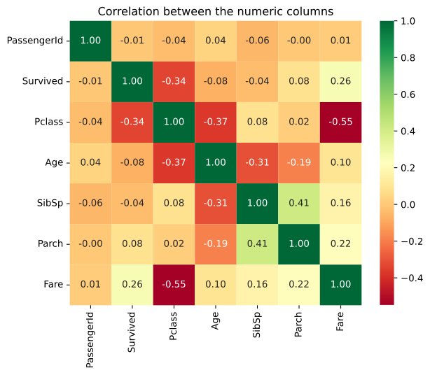
What the heatmap says about Survived
- Pclass is the strongest relationship with survival, -0.338. The class number rises from 1 to 3 as survival falls, so first class passengers survived more often.
- Fare is next, +0.257. A higher fare goes with a higher chance of survival, which is the same fact seen from the other side, since fare and class are tied.
- PassengerId is -0.005. A row number has no relationship with anything, which is how a heatmap shows you a column to drop.
- Age is -0.077 and it is computed from 714 rows.
corrskips the pairs where either value is missing, so this number ignores 177 passengers.
Correlation between -0.1 and 0.1 is no straight line relationship. Dropping columns on that basis is the subject of Dropping correlated features, which looks at pairs of features rather than at the target.
One pair as a scatter plot
A correlation of 0.0961 between Age and Fare is a single number for 714 pairs, and it can hide a great deal. The scatter plot puts one dot per passenger at their age and their fare, which shows what the number could not.
print("pairs plotted:", int(df[['Age', 'Fare']].dropna().shape[0]))
print("correlation:", round(df['Age'].corr(df['Fare']), 4))
print(df.nlargest(3, 'Fare')[['Age', 'Fare', 'Ticket']].to_string())

fig, ax = plt.subplots(figsize=(6.5, 4.5))
ax.plot(df['Age'], df['Fare'], 'o', markersize=4, alpha=0.6, color='#3a6fd8')
ax.set_xlabel('Age')
ax.set_ylabel('Fare')
ax.set_title('Fare against Age, one dot per passenger')
fig.savefig('chart.svg')pairs plotted: 714
correlation: 0.0961
Age Fare Ticket
258 35.0 512.3292 PC 17755
679 36.0 512.3292 PC 17755
737 35.0 512.3292 PC 17755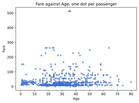
- There is no trend to see. The dots form a band of low fares at every age, which is what a correlation of 0.0961 looks like.
- Three dots sit at 512.3292. They are one booking, ticket PC 17755, shared by three passengers aged 35, 36 and 35, so two of the dots overlap.
- Dots line up along certain fares. Horizontal rows of dots appear where dozens of passengers paid exactly the same amount, because fares came from a price list rather than from a continuum.
Every pair in one figure
sns.pairplot draws a scatter plot for each pair of columns and a histogram of each column on the diagonal. It is the fastest way to see several relationships, and it is expensive: the figure holds one panel per pair, so four columns make sixteen panels. corner=True draws only the lower half, since the upper half is the same pairs mirrored. A sample of 200 rows keeps the panels readable.
sample = df[['Age', 'Fare', 'Pclass']].dropna().sample(200, random_state=0)
grid = sns.pairplot(sample, corner=True, height=2.0, plot_kws={'s': 12})

print("rows plotted:", len(sample))
print("panels drawn:", sum(a is not None for a in grid.axes.flat))
grid.figure.savefig('chart.svg')rows plotted: 200 panels drawn: 6
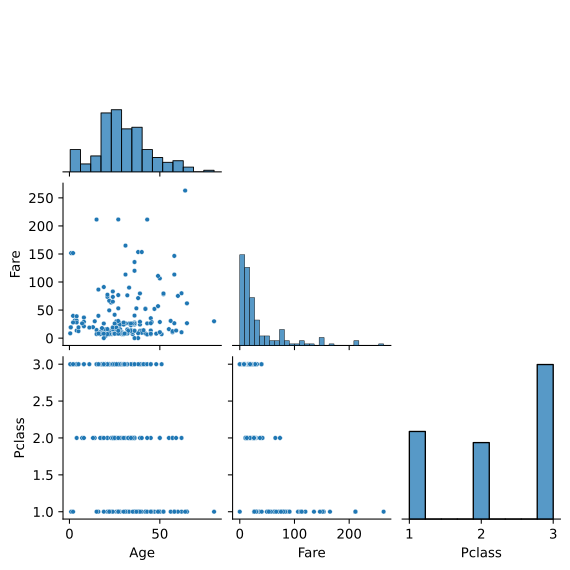
The Pclass row is the useful one. Fares in class 1 spread from low to very high, class 2 sits in a narrow band and class 3 is squeezed at the bottom, which is the -0.55 the heatmap printed for that pair, seen as points.
Scatter plot vs pair plot vs heatmap
| Scatter plot | Pair plot | Correlation heatmap | |
|---|---|---|---|
| Pairs shown | one | every pair of the columns given | every numeric pair |
| Shows the shape | yes | yes, smaller | no, one number per pair |
| Shows a curved relationship | yes | yes | no, Pearson measures straight lines only |
| Cost on 891 rows | cheap | slow, and a large figure | cheap |
| Use it for | a pair you care about | a first look at four or five columns | ranking every pair, then picking which to plot |
Pearson correlation measures a straight line only. Two features can sit on a perfect curve and still score near 0, so a heatmap of zeros is not proof of independence; it is proof of no straight line.
Where relationships are checked
- Choosing features for a model. A feature with no relationship to the target and no relationship to anything else is a column of noise.
- Finding duplicated information. Fare and Pclass at -0.55 carry much of the same fact, and keeping both is the multicollinearity that Dropping correlated features handles.
- Explaining a dataset to someone. One heatmap and two scatter plots describe a table faster than any amount of prose.
corr computes each pair on the rows where both values are present, so different cells of the same heatmap can rest on different numbers of rows. Age's correlations use 714 rows and Fare's use 891, and the chart shows no sign of it. Impute or drop the missing values first, and say which you did.Related
- Previous: Distributions with histograms, KDE and box plots
- Next: Why values go missing
- See also: Dropping correlated features
- Reference: DataFrame.corr and seaborn.pairplot
- Change
cmap='RdYlGn'tocmap='coolwarm'and read whether your conclusions survive the colour change. - Add
'SibSp'to the pair plot's columns and count how many panels appear. - Compute
df['Fare'].corr(df['Pclass'])and check it against the heatmap cell.
You understood something today that you didn't yesterday.