
Distributions with histograms, KDE and box plots
A distribution is how the values of one numeric column spread out, and three charts read it: a histogram counts the values in bins, a KDE curve smooths those counts into a line, and a box plot marks the quartiles and the far out points.
Last updated: 12 Oct, 2026 · pandas 3.0 · seaborn 0.13 · matplotlib 3.11
Counting a category, which Count plots and bar plots in seaborn finished, works because the values repeat. A fare of 71.2833 repeats for nobody, so counting it gives 891 groups of one. A numeric column needs bins, a curve or quartiles instead.

The shape decides what else is safe to do. A symmetric column can be summarised by its mean and filled with its mean. A skewed column has a mean that no longer sits where most of the data is, so its median is the honest centre, which is the argument Mean and median imputation runs on.
Syntax: Series.hist(bins=...) draws a histogram with pandas, sns.histplot(data=, x=, kde=True) adds the smoothed curve, sns.kdeplot(data=, x=) draws the curve alone, and DataFrame.boxplot(column=...) draws a box plot.
df['Age'].hist(bins=50, ax=ax)                  # counts per bin
sns.histplot(data=df, x='Age', bins=30, kde=True, ax=ax)   # bins plus a curve
sns.kdeplot(data=df, x='Age', ax=ax, fill=True)            # the curve alone
df.boxplot(column='Age', ax=ax)                 # quartiles and far out points
df['Age'].quantile([0.25, 0.5, 0.75])           # the three numbers in the box
Loading the Titanic data
These examples move to the Titanic table, 891 passengers with an Age that is missing for 177 of them and a Fare that is not. It loads straight from its GitHub URL, and usecols keeps the three columns used here. Run this block first, then the example under it.
import pandas as pd
import matplotlib
matplotlib.use('svg')
import matplotlib.pyplot as plt

url = ("https://raw.githubusercontent.com/krishnaik06/"
       "Feature-Engineering-Live-sessions/master/titanic.csv")
df = pd.read_csv(url, usecols=['Survived', 'Age', 'Fare'])
Counting values into bins
A histogram cuts the range of the column into equal width bins and counts how many values fall in each. bins=50 over an age range of 0.42 to 80 makes each bin about 1.6 years wide. describe() prints the numbers the chart is drawing.
print(df[['Age', 'Fare']].describe().round(3).to_string())
print()
print("ages recorded:", int(df['Age'].notna().sum()), "of", len(df))

fig, ax = plt.subplots(figsize=(7, 4))
df['Age'].hist(bins=50, ax=ax, color='#3a6fd8')
ax.set_xlabel('Age')
ax.set_ylabel('passengers')
ax.set_title('Age of the passengers whose age is recorded')
fig.savefig('chart.svg')Age Fare count 714.000 891.000 mean 29.699 32.204 std 14.526 49.693 min 0.420 0.000 25% 20.125 7.910 50% 28.000 14.454 75% 38.000 31.000 max 80.000 512.329 ages recorded: 714 of 891
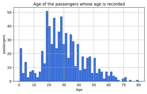
What the histogram and describe agree on
- 714 of 891 ages are recorded. The histogram is drawn from those 714; the 177 missing ones are not a bar of zero, they are absent, and nothing on the chart says so.
- The hump sits between 20 and 38. That is the quartile range printed by
describe(), 20.125 to 38.0, with a median of 28.0. - Mean 29.699 and median 28.0 are close, so Age leans right only slightly.
- Fare is a different animal. Its median is 14.454 and its maximum is 512.329, so half the passengers paid less than a thirtieth of the top fare.
Smoothing the counts into a curve
A KDE, a kernel density estimate, replaces each value with a small bump and adds the bumps up, which gives a curve instead of steps. It is easier to compare two columns with and it hides how few points some regions hold. The y axis is a density, so the area under the curve is 1 and the height is not a count of passengers.
fig, axes = plt.subplots(1, 2, figsize=(11, 4))
sns.histplot(data=df, x='Age', bins=30, kde=True, ax=axes[0])
axes[0].set_title('histplot with kde=True')
sns.kdeplot(data=df, x='Age', ax=axes[1], fill=True)
axes[1].set_title('kdeplot on its own')
print("rows used by both panels:", int(df['Age'].notna().sum()))
fig.savefig('chart.svg')rows used by both panels: 714
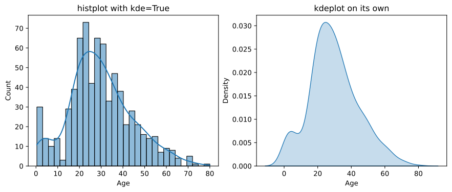
The small bump near zero is the infants, and the curve smooths it into a shoulder that the histogram shows as a separate spike. A KDE invents a little data between the points it was given, which is the price of the smoothing.
The function that was removed
Notebooks from before 2021 draw this with sns.distplot. It is deprecated in seaborn 0.13 and removed in 0.14, and there are two replacements: sns.histplot for an axes level chart, which is what the examples here use, and sns.displot for a figure level one that creates its own figure.
sns.distplot(df['Age'].dropna())              # removed in seaborn 0.14
sns.histplot(data=df, x='Age', kde=True)      # the axes level replacement
sns.displot(data=df, x='Age', kde=True)       # the figure level replacement
Reading the quartiles off a box plot
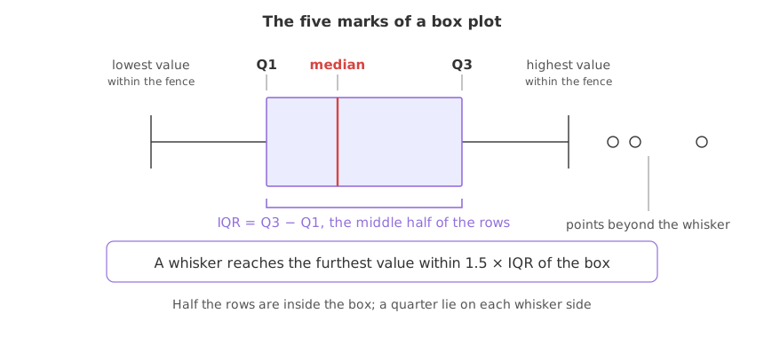
A box plot draws five numbers. The box spans the first quartile to the third, the line inside it is the median, and the whiskers reach the furthest value within 1.5 times the box's height of either end. Everything past a whisker is drawn as a separate point.
q1, q2, q3 = df['Fare'].quantile([0.25, 0.5, 0.75])
iqr = q3 - q1
print(f"Q1 {q1:.4f}   median {q2:.4f}   Q3 {q3:.4f}   IQR {iqr:.4f}")
print(f"the upper whisker can reach {q3 + 1.5 * iqr:.4f}")
print("points drawn beyond it:", int((df['Fare'] > q3 + 1.5 * iqr).sum()))

fig, axes = plt.subplots(1, 2, figsize=(9, 4))
df.boxplot(column='Age', ax=axes[0])
df.boxplot(column='Fare', ax=axes[1])
fig.savefig('chart.svg')Q1 7.9104 median 14.4542 Q3 31.0000 IQR 23.0896 the upper whisker can reach 65.6344 points drawn beyond it: 116
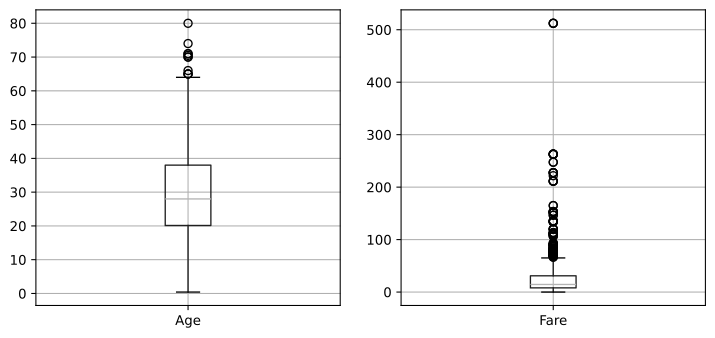
- Fare's box is 7.9104 to 31.0, so half the passengers paid between those two fares, and the median is 14.4542.
- The upper whisker reaches no further than 65.6344. That is Q3 plus 1.5 times the interquartile range of 23.0896, and 116 passengers are drawn as points above it.
- Age's box plot is almost symmetric. The median sits near the middle of the box and only a handful of points lie beyond a whisker.
- The two charts cannot share an axis. Fare reaches 512 and Age stops at 80, which is why they are drawn in two panels.
The 116 points past Fare's whisker are what The IQR fence treats as outliers, and the 1.5 is the number it argues about. Here they are a reading, not a verdict.
Histogram vs KDE vs box plot
| Histogram | KDE curve | Box plot | |
|---|---|---|---|
| Shows | counts per bin | a smoothed density | five numbers and the far out points |
| Depends on | the number of bins | the smoothing bandwidth | nothing you choose |
| Reads the shape | yes, honestly | yes, smoothed | only the skew |
| Reads exact values | no | no | yes, the quartiles |
| Shows single far out values | as a one high bar, easy to miss | no, it is smoothed away | yes, each as a point |
| Compares two columns | awkward | easy, overlay the curves | easy, side by side |
Where a distribution has to be checked
- Before choosing a fill value. Mean or median follows from the shape, which is the first question in Mean and median imputation.
- Before scaling. Standardisation assumes a shape that a skewed column does not have, which is why Log, reciprocal and square root transformations exists.
- Before trusting a mean. Fare's mean of 32.204 is above its third quartile of 31.0, so more than three quarters of the passengers paid less than the average fare.
Related
- Previous: Count plots and bar plots in seaborn
- Next: Relationships between features
- See also: The IQR fence
- Reference: seaborn.histplot and DataFrame.boxplot
- Change
bins=50tobins=5and then tobins=200, and write which shape you would have reported from each. - Draw
df['Fare'].hist(bins=50)and read how far the tail goes compared with Age. - Print
df['Age'].quantile([0.25, 0.5, 0.75])and check the three numbers against the box in the chart.
Little by little, you're building something great.