
One chart, one question, one observation
One chart, one question, one observation is a way of working through a dataset: you write the question down first, draw the one chart that answers it, and write the answer under the chart in your own words before moving on.
Last updated: 12 Oct, 2026 · pandas 3.0 · seaborn 0.13 · matplotlib 3.11
The audit is finished. Duplicates left a frame whose rows are each a real restaurant, and the missing values are counted. Charting starts here, and it starts with a question rather than with a chart type.
The habit in the clip is the whole method. A chart is drawn, and then the reading of it is typed out as a sentence: one line about how many restaurants carry no rating at all, and one about where the ratings pile up. The chart is the evidence; the sentence is the finding.
Starting from the question, not the chart type
A chart drawn without a question gives you a picture to interpret afterwards, and the interpretation drifts towards whatever the picture happens to show. A question fixes what counts as an answer before you can be impressed by a shape. Three questions about the Zomato table, written as plain English:
- How many restaurants fall in each rating band? One categorical column, counted.
- Which countries is this data about? One categorical column, counted and ranked.
- Do higher fares go with older passengers? Two numeric columns, compared.
Each one names its columns and the comparison, so the chart follows from the question instead of the other way round.
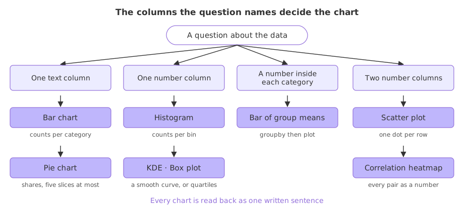
Which chart answers which shape of question is settled by the columns involved, and the map above is the whole of it. Counting one text column is a bar chart. The shape of one number column is a histogram, a KDE curve or a box plot, all three in Distributions with histograms, KDE and box plots. Two number columns are a scatter plot, in Relationships between features.
Loading the Zomato data
Every example here starts from the merged Zomato frame. The zip recipe is the one Reading a CSV that is not UTF-8 built, and the join on the country code is the one Merging a lookup table built. Run this block first, then the example under it.
import io, zipfile, urllib.request
import pandas as pd
import matplotlib
matplotlib.use('svg')
import matplotlib.pyplot as plt

url = ("https://raw.githubusercontent.com/krishnaik06/"
       "5-Days-Live-EDA-and-Feature-Engineering/main/Zomatodataset.zip")
zf = zipfile.ZipFile(io.BytesIO(urllib.request.urlopen(url).read()))
with zf.open('zomato.csv') as fh:
    df = pd.read_csv(fh, encoding='latin-1')
with zf.open('Country-Code.xlsx') as fh:
    codes = pd.read_excel(fh)
df = pd.merge(df, codes, on='Country Code', how='left')
Counting restaurants per rating band
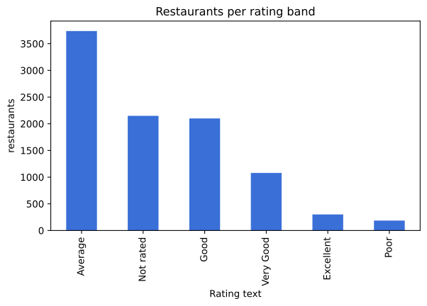
The question: how many restaurants fall in each rating band? Rating text holds one of six words per restaurant, so counting that column answers it. value_counts() returns the counts, biggest first, and plot.bar() draws the Series it returns.
bands = df['Rating text'].value_counts()
print(bands.to_string())
print()
print("share of all 9551 rows, in percent:")
print((bands / len(df) * 100).round(2).to_string())

fig, ax = plt.subplots(figsize=(7, 4))
bands.plot.bar(ax=ax, color='#3a6fd8')
ax.set_xlabel('Rating text')
ax.set_ylabel('restaurants')
ax.set_title('Restaurants per rating band')
fig.savefig('chart.svg')Rating text Average 3737 Not rated 2148 Good 2100 Very Good 1079 Excellent 301 Poor 186 share of all 9551 rows, in percent: Rating text Average 39.13 Not rated 22.49 Good 21.99 Very Good 11.30 Excellent 3.15 Poor 1.95
Reading the chart into two sentences
- 2,148 restaurants carry no rating at all. That is 22.49 percent of the table, so more than a fifth of the rows have no opinion in them.
- Average is the largest band, with 3,737 restaurants. Of the rated restaurants, the middle of the scale is where most of them sit.
- Excellent and Poor are both rare, 301 and 186 restaurants. The extremes of the scale carry around 5 percent of the data between them.
Those three lines are the output of the lesson, not the picture. A chart you cannot summarise in a sentence has not been read yet.
Writing the observation where it will be found again
The place for the sentence is next to the chart, in the notebook, as a markdown cell. Written there it survives the next run and can be pasted into a report. Written nowhere, it is gone by the time you draw the next chart.
# Observation
# 2148 of 9551 restaurants (22.49%) have no aggregate rating.
# The largest rated band is Average, 3737 restaurants.
# Excellent (301) and Poor (186) are rare.
A chart with a question vs a chart without one
| Chart first | Question first | |
|---|---|---|
| What you start with | a chart type you like | a sentence naming two columns |
| When you stop | when the figure looks nice | when the question is answered |
| What you keep | the image | the image and one written sentence |
| Risk | reading a shape that is an artefact of the chart | missing a pattern you did not ask about |
| Fix for the risk | ask what the question was | keep a second pass for shapes, with distributions and scatter plots |
Where this method earns its keep
- A first pass over an unfamiliar table. Ten questions, ten charts, ten sentences, and you can describe the dataset to someone else without opening it.
- A report for someone who will not run the code. The sentences are the report and the charts are its evidence.
- Deciding what to fix. The observation that a fifth of the ratings are absent is what sends you to the missing value techniques rather than to the model.
len(df) before concluding that a category is missing from the data rather than from the chart.Related
- Previous: Duplicates
- Next: Counting categories with value_counts
- See also: The missing value map
- Reference: DataFrame.plot.bar in the pandas docs
- Change
Rating texttoPrice rangeand write the one sentence the new chart supports. - Add
bands.sort_index()beforeplot.bar()and read what the alphabetical order does to the story the chart tells. - Ask a question the chart cannot answer, such as which city has the best ratings, and note which two columns you would need.
Little by little, you're building something great.