
The missing value map
A missing value map is the count and the share of empty cells in every column of a table, read with isnull().sum() and isnull().mean() and drawn as a bar chart.
Last updated: 12 Oct, 2026 · pandas 3.0 · scikit-learn 1.9
The first look at a dataset gave a non-null count per column inside info(). This lesson turns that into the first real decision of a project: which columns have holes in them, how big the holes are, and which of them are worth keeping at all.
Syntax: isnull() gives a frame of True and False, and the two reductions over it answer two different questions.
df.isnull()           # True where the cell is empty, one per cell
df.isnull().sum()     # how many empty cells per column, a count
df.isnull().mean()    # what share of the column is empty, between 0 and 1
df.isnull().sum().sum()   # how many empty cells in the whole table
Counting the empty cells
isnull() returns a frame the same shape as df, holding True where a value is missing. sum() over it counts the Trues per column, because True counts as 1. A second sum() reduces that to one number for the whole table.
Printing one line per column is unreadable on a wide table, so keep only the columns that have something to report. The list comprehension does that, and so does the mask on the Series.
print("missing values in the whole table:", df.isnull().sum().sum())

with_nulls = [c for c in df.columns if df[c].isnull().sum() > 0]
print("columns with any missing value:", with_nulls)
print(df.isnull().sum()[df.isnull().sum() > 0].to_string())missing values in the whole table: 9 columns with any missing value: ['Cuisines'] Cuisines 9
- 9 missing cells in a table of 9551 rows and 21 columns. Out of 200571 cells, that is as clean as a real dataset gets.
- Only
Cuisinesis affected. The comprehension and the mask give the same answer, and the comprehension is the one to reach for when you want the names as a list to loop over. - Nine rows out of 9551 is 0.09%. Dropping those rows costs almost nothing, which is the one case where dropping is an easy decision.
Reading the share instead of the count
A count depends on the size of the table: 177 missing values is most of a 200 row table and a rounding error in a million row one. isnull().mean() gives the share instead, because the mean of a column of True and False is the proportion of Trues. Multiplying by 100 makes it a percentage.
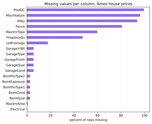
The Zomato table has one column to report. The house price table has nineteen, which is what a missing value map is for.
import pandas as pd

AMES = ("https://raw.githubusercontent.com/krishnaik06/"
        "Advanced-House-Price-Prediction-/master/train.csv")
ames = pd.read_csv(AMES)

share = ames.isnull().mean()
share = share[share > 0].sort_values(ascending=False)
print("columns with any missing value:", len(share), "of", ames.shape[1])
print((share * 100).round(1).head(8).to_string())columns with any missing value: 19 of 81 PoolQC 99.5 MiscFeature 96.3 Alley 93.8 Fence 80.8 MasVnrType 59.7 FireplaceQu 47.3 LotFrontage 17.7 GarageType 5.5
Drawing the map
The video draws this map as a heatmap of df.isnull(). On the Zomato table it shows almost nothing, because nine empty cells out of 200571 are invisible, and on a wide table a heatmap draws one mark per cell. The chart here is a bar chart of the share per column instead, which says the same thing in one bar per column.
A bar chart of the share per column is the map. Each bar is a column, its length is the percentage of rows that are empty there, and the sort puts the worst at one end so that the shape of the problem is visible at a glance. plot.barh draws horizontal bars, which leaves room for long column names.
import matplotlib.pyplot as plt

fig, ax = plt.subplots(figsize=(7, 6))
(share * 100).sort_values().plot.barh(ax=ax, color="#9370DB")
ax.set_xlabel("percent of rows missing")
ax.set_title("Missing values per column, Ames house prices")
ax.grid(axis='x', linestyle=':', alpha=0.6)
plt.show()

print("worst:", share.index[0], round(share.iloc[0] * 100, 1), "percent")
print("mildest:", share.index[-1], round(share.iloc[-1] * 100, 1), "percent")worst: PoolQC 99.5 percent mildest: Electrical 0.1 percent
What the map says to do
- Four columns above 80%.
PoolQCis empty for 99.5% of the houses: 7 of the 1460 have a value. A column with seven values carries almost no information, and filling it would invent the other 1453. These are the candidates for dropping. - Two columns between 40% and 60%.
MasVnrTypeandFireplaceQuare missing for about half the houses. Filling half a column with one value creates a category that dominates the data. LotFrontageat 17.7%. A genuine imputation case: enough values present to learn from, enough missing to matter.- Five garage columns at exactly 5.5%, and five basement columns at about 2.5%. Identical shares across a group of columns is a pattern, not a coincidence: the house has no garage, so every garage column is empty on that row. The gap means something, and that meaning can be kept.
Electricalat 0.1%, a single row. Drop the row and move on.
Which of those to do is the next part of the course, starting at Why values go missing. The map is what tells you which question to ask about each column.
Count vs share vs a chart
isnull().sum() | isnull().mean() | A bar chart | |
|---|---|---|---|
| What it gives | A count per column | A share between 0 and 1 | A picture of every column |
| Good for | A single column, or a quick total | Comparing columns of one table | Twenty columns or more |
| Independent of table size | No | Yes | Yes |
| Reads well on a wide table | No, one line per column | No, same problem | Yes, sorted and horizontal |
Where the map is used
- The first five minutes with a new table. It decides which columns you can use, which need a technique and which are not worth the effort.
- After a merge. A column that was complete and is now 30% empty means the join key did not match on those rows.
- Comparing a training set with a test set. A column missing in one and not the other is a problem that shows up at prediction time, not at training time.
isnull() finds only the cells pandas already knows are empty. A 0 in an age column, a -1 in a price and the strings 'NA', '?' and 'unknown' all count as present, so a map built on isnull() alone can report a column as complete when a quarter of it is a placeholder. Run value_counts() on a column that looks too clean, and turn the placeholders you find into real missing values with pd.read_csv(..., na_values=['?', 'unknown']).Related
- Previous: The first look at a dataset
- Next: Merging a lookup table
- Reference: Working with missing data in the pandas user guide
- Print
ames.isnull().sum(axis=1).value_counts().head()to count missing values per row instead of per column. Every house is missing at least one value; which count is the most common? - Change the threshold in
share[share > 0]toshare[share > 0.05]and see which columns the map keeps. - Build the same map for the Titanic table and compare: three columns instead of nineteen, and one of them above 70%.
Slow is fine. Stopping is the only problem.