
Reading a Q-Q plot
A Q-Q plot is a chart that puts a column's sorted values against the values a normal distribution would have produced, so a straight line means the column is close to normal.
Last updated: 12 Oct, 2026 · pandas 3.0 · scikit-learn 1.9 · scipy 1.18
Robust scaling ended on a column that is still skewed after scaling. Deciding what to do about that needs a way to see the shape, and a histogram is a poor judge of the tails. The Q-Q plot is the chart that answers the question, and it is what every transformation in the rest of this part is judged by.
What the two axes hold
- The x axis is theoretical quantiles. Sort a sample of the same size drawn from a standard normal distribution and these are the values you would expect to see.
- The y axis is the column's own sorted values.
- The red line is the fit. It is drawn through the points by least squares, so it shows where the column would sit if it were normal.
- Points on the line mean normal. Any systematic curve away from it is the column telling you which part of its shape disagrees.
Syntax: scipy.stats.probplot returns the two coordinate arrays and the fitted line, so the chart can be drawn by hand and the fit can be read as a number.
import scipy.stats as stats

# osm = theoretical quantiles, osr = the sorted column
(osm, osr), (slope, intercept, r) = stats.probplot(values, dist='norm')
Drawing a Q-Q plot for Age and Fare
The two Titanic columns are at opposite ends. Age is close to symmetric, Fare has a long right tail. Plotting the sorted values as a curve against the fitted line makes the difference obvious at a glance.
import pandas as pd

URL = "https://raw.githubusercontent.com/krishnaik06/Feature-Engineering-Live-sessions/master/titanic.csv"
df = pd.read_csv(URL, usecols=['Age', 'Fare'])
df['Age'] = df['Age'].fillna(df['Age'].median()) # 177 missing ages, filled with 28.0def qq(ax, values, title):
(osm, osr), (slope, intercept, r) = stats.probplot(values, dist='norm')
ax.plot(osm, slope * osm + intercept, color='#c23b22', lw=1.2, ls='--')
ax.plot(osm, osr, color='#3a6fd8', lw=1.6) # the sorted values
ax.set_title(f'{title} (R²={r ** 2:.3f})', fontsize=10)import matplotlib.pyplot as plt
import numpy as np
import scipy.stats as stats
def qq(ax, values, title):
    (osm, osr), (slope, intercept, r) = stats.probplot(values, dist='norm')
    ax.plot(osm, slope * osm + intercept, color='#c23b22', lw=1.2, ls='--')
    ax.plot(osm, osr, color='#3a6fd8', lw=1.6)        # the sorted values
    ax.set_title(f'{title}  (R²={r ** 2:.3f})', fontsize=10)
ax.set_xlabel('normal quantiles'); ax.set_ylabel('observed')
return r ** 2
fig, ax = plt.subplots(1, 2, figsize=(9, 3.6))
for a, col in zip(ax, ['Age', 'Fare']):
fit = qq(a, np.asarray(df[col]), col)
print(f"{col:5s} skew {stats.skew(df[col]):7.3f} R² of the Q-Q line {fit:.4f}")
fig.tight_layout()Age skew 0.509 R² of the Q-Q line 0.9542 Fare skew 4.779 R² of the Q-Q line 0.5190
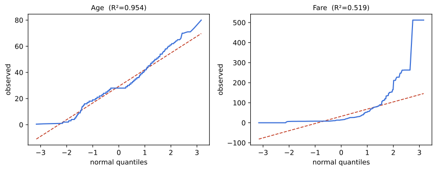
Reading the two charts
- Age, R² 0.9542. The curve follows the line through the middle. It sits above the line at the far left, because no passenger is younger than 0.42 while a normal distribution would have reached further down, and it rises above the line at the far right, because the oldest passengers reach further up than normal values would. The flat step in the middle is the 177 ages filled with the median of 28.
- Fare, R² 0.5190. The curve sits below the line for most of the range and then rises almost vertically. That is the signature of a long right tail: a handful of values far above everything else.
- Skew agrees with the picture. Age is 0.509 and Fare is 4.779. A symmetric column scores near zero; a positive score means the tail points right.
Four shapes and what each one means
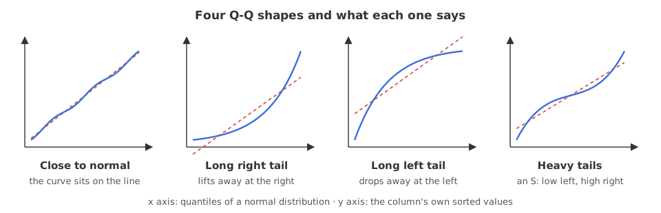
- Along the line. The column is close to normal and needs no transformation.
- Bending up at the right end. A long right tail: the largest values are much larger than a normal distribution would give. Fare is this shape.
- Bending down at the left end. A long left tail, the mirror image.
- An S shape, below the line on the left and above on the right. Both tails are heavier than normal, with no skew in either direction.
What the number adds to the eye
The video judges every chart by looking at it. R², the square of the correlation probplot already returns, turns the same judgement into a number that can be compared across transformations. A sample that is known to be normal gives the scale to compare it against.
import numpy as np
import scipy.stats as stats

rng = np.random.default_rng(42)
normal = rng.normal(size=891)              # 891 values drawn from a normal distribution
(_, _), (_, _, r) = stats.probplot(normal, dist='norm')

print("a real normal sample  R²", round(r ** 2, 4), " skew", round(float(stats.skew(normal)), 3))
for col in ['Age', 'Fare']:
    (_, _), (_, _, r) = stats.probplot(np.asarray(df[col]), dist='norm')
print(f"{col:20s} R²", round(r ** 2, 4), " skew", round(float(stats.skew(df[col])), 3))a real normal sample R² 0.9988 skew 0.024 Age R² 0.9542 skew 0.509 Fare R² 0.519 skew 4.779
- 0.9988 is what a normal column scores. That is the yardstick: anything near it is normal enough for a model that assumes normality.
- Age at 0.9542 is close but not there.
- Fare at 0.5190 is not close. This is the column a transformation has to fix.
- Use R² to rank transformations, not to pass or fail a column. There is no threshold that makes a column normal, and formal tests such as Shapiro-Wilk reject almost any large sample.
A Q-Q plot compared with a histogram
| Histogram | Q-Q plot | |
|---|---|---|
| Shows | where the mass of the data is | how the sorted values line up against normal ones |
| Tails | hidden, a handful of rows is one invisible bar | the whole right hand side of the chart |
| Depends on | the number of bins | nothing you choose |
| Reads as | a shape you interpret | a straight line, or not |
| Use it to | see the centre and the spread | decide whether a transformation is needed |
Where a Q-Q plot is used
- Before choosing a scaler. A column on the line can be standardised; a column far off it needs a transformation first.
- To compare transformations. Draw one Q-Q plot per candidate and keep the straightest.
- On the residuals of a regression, where normality of the errors is the assumption that matters most.
probplot on a column that still contains NaN returns nan for the correlation and draws an empty chart. It raises nothing. Fill or drop the missing values first, then plot. The same silence catches scipy.stats.boxcox, which returns a lambda of nan on a column with a single NaN in it.Related
- Previous: Robust scaling
- Next: Log, reciprocal and square root transformations
- See also: Distributions with histograms, KDE and box plots
- Reference: scipy.stats.probplot in the SciPy docs
- Pass
dist='expon'toprobplotand plot Fare again. The curve straightens, because an exponential distribution is a much better description of it. - Plot the Q-Q chart of
df['Age']before the median fill. The flat step in the middle disappears and R² changes. - Draw a Q-Q plot of 30 values from
rng.normalinstead of 891. Even a truly normal sample wanders off the line when it is small.
Every expert started right here.