
Robust scaling
RobustScaler subtracts the median and divides by the interquartile range, so the middle half of the data sets the scale and extreme values do not.
Last updated: 12 Oct, 2026 · pandas 3.0 · scikit-learn 1.9 · scipy 1.18
Min max scaling left half the Titanic fares inside the bottom three percent of the scaled range, because one ticket decided the maximum. The third scaler answers that by throwing away the two ends and measuring with the quartiles.
Percentiles and quartiles
A percentile is the value a given share of the data falls below. In the sorted list 0, 1, 2, 3, 4, 5, 6, 7, 9, 10 the value 9 is the 90th percentile, because 90 percent of the group is below it, and 1 is the 10th percentile. Quartiles are the three percentiles that cut the data into four equal parts: the 25th, the 50th, which is the median, and the 75th.
- Q1 is the 25th percentile. A quarter of the rows sit below it.
- Q2 is the median. Half sit below it.
- Q3 is the 75th percentile. Three quarters sit below it.
- IQR is Q3 minus Q1, the width of the middle half of the data. For Titanic Fare that is 31.0 minus 7.9104, which is 23.0896.
Syntax: the same three calls, with quantile_range if a different pair of percentiles suits the column better.
from sklearn.preprocessing import RobustScaler

scaler = RobustScaler()              # quantile_range=(25.0, 75.0) by default
out = scaler.fit_transform(df)
Scaling the Titanic columns by median and IQR
import pandas as pd

URL = "https://raw.githubusercontent.com/krishnaik06/Feature-Engineering-Live-sessions/master/titanic.csv"
df = pd.read_csv(URL, usecols=['Survived', 'Pclass', 'Age', 'Fare'])
df['Age'] = df['Age'].fillna(df['Age'].median()) # 177 missing ages, filled with 28.0from sklearn.preprocessing import RobustScaler
scaler = RobustScaler().set_output(transform='pandas')
scaled = scaler.fit_transform(df)from sklearn.preprocessing import RobustScaler
scaler = RobustScaler().set_output(transform='pandas')
scaled = scaler.fit_transform(df)
print(scaled.head(3).round(6).to_string())
print("\nlearned center_ (medians):", scaler.center_.tolist())
print("learned scale_ (IQRs) :", scaler.scale_.tolist())
q1, q3 = df["Fare"].quantile(0.25), df["Fare"].quantile(0.75)
print("\nFare Q1, Q3, IQR:", q1, q3, round(q3 - q1, 4))
print("first fare by hand:", round((df.loc[0, "Fare"] - df["Fare"].median()) / (q3 - q1), 6))Survived Pclass Age Fare 0 0.0 0.0 -0.461538 -0.312011 1 1.0 -2.0 0.769231 2.461242 2 1.0 0.0 -0.153846 -0.282777 learned center_ (medians): [0.0, 3.0, 28.0, 14.4542] learned scale_ (IQRs) : [1.0, 1.0, 13.0, 23.0896] Fare Q1, Q3, IQR: 7.9104 31.0 23.0896 first fare by hand: -0.312011
Reading the centred columns
center_holds the medians andscale_holds the interquartile ranges: 28.0 and 13.0 for Age, 14.4542 and 23.0896 for Fare.- A value of 0 means the median. The first passenger's Pclass is 0.0 because 3 is the median class, not because the value is zero.
- One unit means one interquartile range. The second passenger's fare of 71.28 comes out at 2.46, which reads as two and a half middle halves above the typical fare.
- The range is not bounded. The 512.33 fare still transforms to 21.56, so the extreme value is still in the data. It no longer decides what the other 890 values look like.
The same column through all three scalers
Fare is the column where the three disagree, so it is the one to plot. The first panel is the raw column and the other three are the same 891 fares after each transform. Every axis is windowed on the busy part of the range, because the 512.33 ticket would otherwise flatten all four charts.
import pandas as pd
import matplotlib.pyplot as plt
from sklearn.preprocessing import StandardScaler, MinMaxScaler, RobustScaler

# the window is the slice of each axis worth looking at, not a change to the data
panels = [(None, 'Fare, raw', (0, 120)),
          (StandardScaler(), 'StandardScaler', (-1, 2)),
          (MinMaxScaler(), 'MinMaxScaler', (0, 0.2)),
          (RobustScaler(), 'RobustScaler', (-1, 3))]
fig, ax = plt.subplots(1, 4, figsize=(13, 3.1))
for a, (scaler, name, window) in zip(ax, panels):
    fare = df['Fare'] if scaler is None else pd.Series(scaler.fit_transform(df[['Fare']])[:, 0])
    a.hist(fare, bins=40, range=window, color='#d8733a')
    a.set_title(f"{name}\nmedian at {fare.median():.3f}", fontsize=10)
    a.set_xlabel('Fare value')
    print(f"{name:15s} median {fare.median():8.4f}   max {fare.max():8.4f}")
fig.tight_layout()Fare, raw median 14.4542 max 512.3292 StandardScaler median -0.3574 max 9.6672 MinMaxScaler median 0.0282 max 1.0000 RobustScaler median 0.0000 max 21.5627
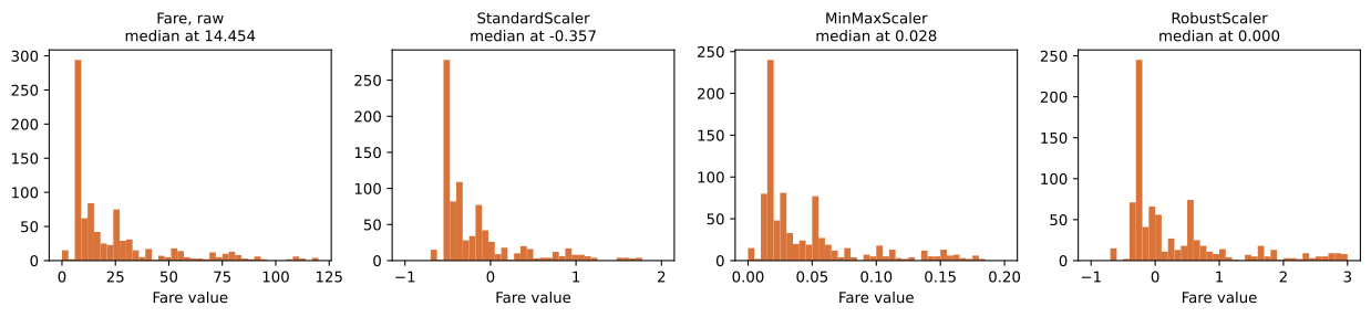
- The raw column has its median at 14.4542 and a maximum of 512.3292. That is the shape all three scalers start from.
- StandardScaler puts the median at −0.357, because the mean fare is pulled above the median by the expensive tickets.
- MinMaxScaler puts it at 0.0282, pressed against the left edge.
RobustScalerputs it at exactly 0, by construction, with the middle half of the fares spread from about −0.28 to 0.72.
Choosing between the three scalers
| StandardScaler | MinMaxScaler | RobustScaler | |
|---|---|---|---|
| Centre | the mean | the minimum | the median |
| Spread | the standard deviation | the full range | the interquartile range |
| Moved by one extreme value | a little | completely | not at all |
| Output range | open | 0 to 1 on the fitted data | open |
| Good when | the column is roughly symmetric | a bounded input is needed | the column is skewed or has extreme values |
Where robust scaling is used
- Money columns. Prices, fares, salaries and claim amounts nearly always have a long right tail that would otherwise set the scale.
- Sensor and count data, where a single faulty reading can be orders of magnitude away from everything else.
- Any column a box plot shows with points outside the whiskers, which The IQR fence covers in full.
Related
- Previous: Min max scaling
- Next: Reading a Q-Q plot
- See also: The IQR fence
- Reference: RobustScaler in the scikit-learn docs
- Pass
quantile_range=(10.0, 90.0). The denominator grows, so every scaled value shrinks towards zero. - Pass
with_centering=Falseand look at where the median lands. - Scale
Ageinstead ofFarewith all three scalers. The three pictures are nearly the same, because Age has no extreme tail.
This is what real progress feels like.